Painting can be intimidating. Here are some guidelines and suggestions that will make it easier. I recently had a paint day with Tola and she was gracious enough to take pictures during the process.
Before you begin:
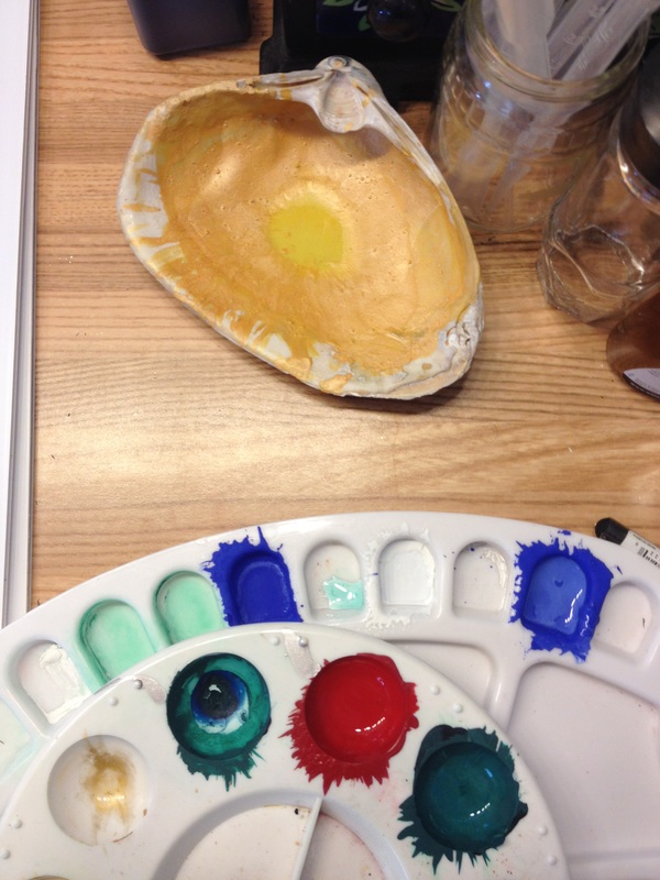
1. Clear surface to paint. Either have a flat or angled surface, but it must be free of things. I clear the entire table for working and then slowly, but surely, things collect to me. Paint, brushes, water, paper. So start with a clear surface.
2. Research the subject will be painting. Produce a layout. Do the layout several times to make sure that you are happy with how everything is arranged. Once you start putting down paint it is more difficult to change. Not impossible, but challenging.
3. Lightly draw the art. If appropriate, use pen and ink to outline. One rule - crow quill pen and ink to outline prior to painting, black paint with a thin brush or crow quill pen after painting. If ink is used after painting, the ink bleeds, although some artists have had some issues with inks bleeding/reconstituting once touched by paint. Your best bet is always to do test pieces with your materials.
Materials:
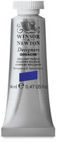
- Windsor Newton Ultramarine
- Windsor Newton Permanent White
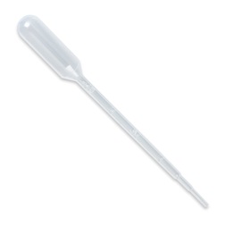
- 3 or 4 pipettes (A pipette or dropper is a laboratory tool commonly used in chemistry, biology and medicine to transport a measured volume of liquid)
- glass container of distilled water
- 2 glass containers of water to clean brushes as you work
- mixing brush or toothpicks
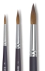
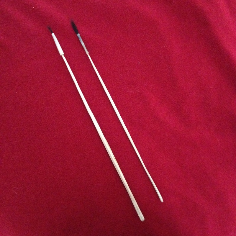
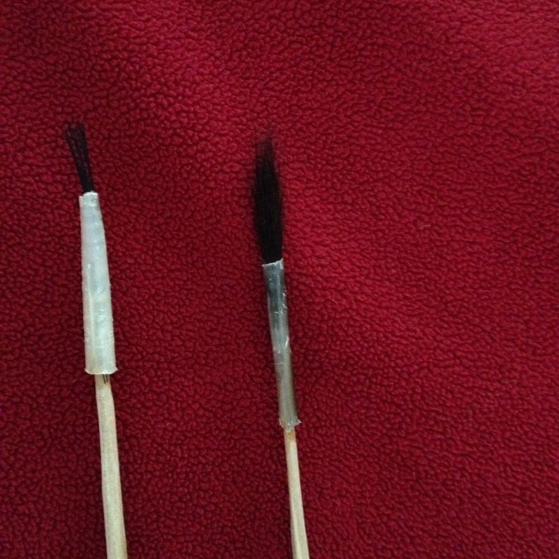
- painting brush
- white glove with thumb and first finger cut out
- paint tray
- paper (Pergamenata, Bristol Board, Opaline Vellum).
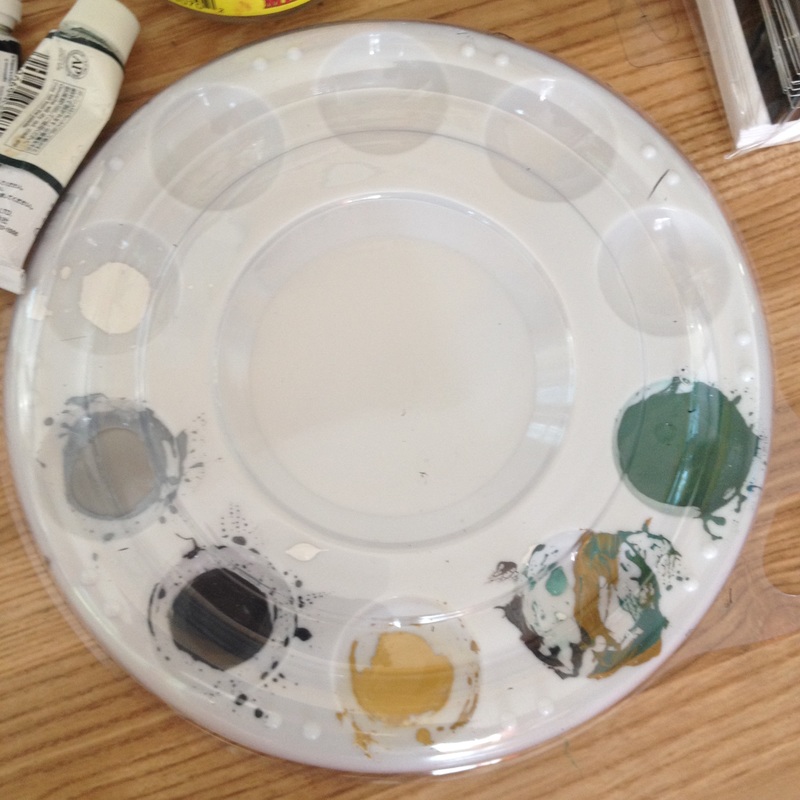
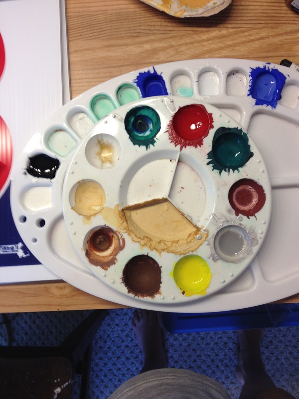
  |   |
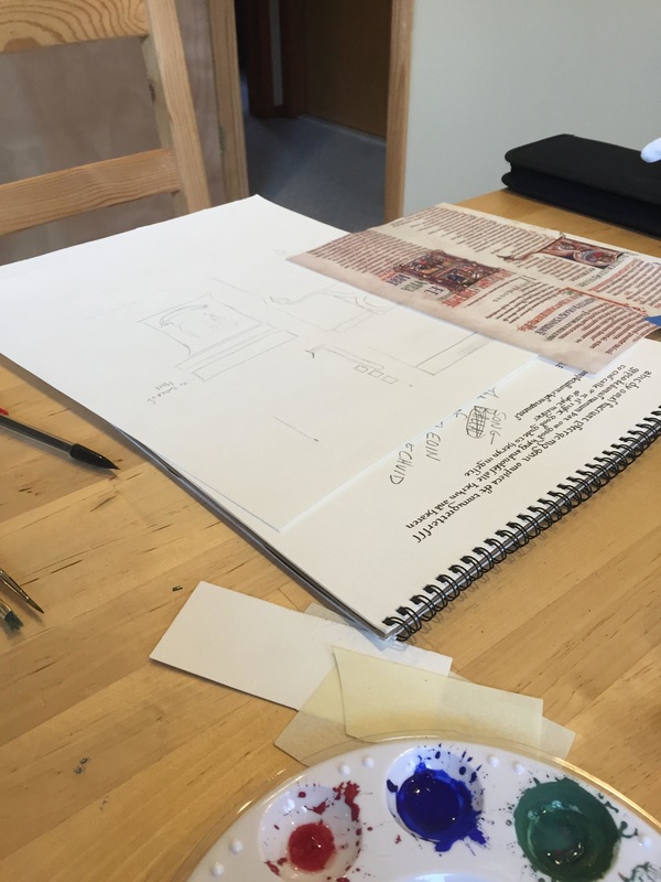
Above: Clean surface, copy of researched art, paint brushes, paint tray with mixed paint, layout, practice paper, scrap paper for color matching, and pencils.
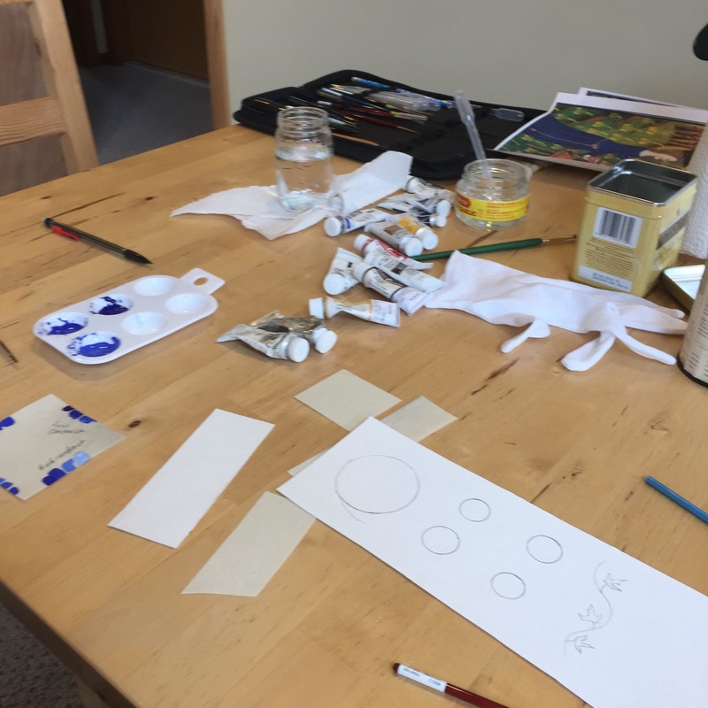
As you can see, more materials just keep on coming to the table.
Let's start.
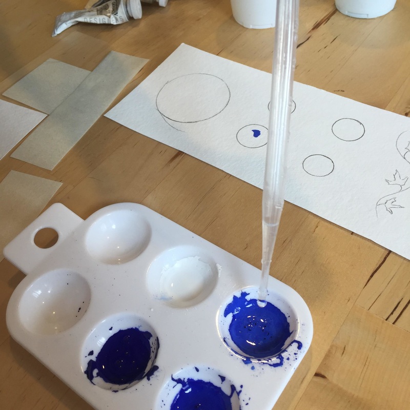
Put a small dollop (see picture below) of blue into one well, and a dollop of white into the other well. Take a pipette and add three drops of distilled water to the blue. Use mixing brush until the water and the blue are mixed together. The desired consistency is that of light cream. If it is too dry, add one drop at a time and continue to mix until the consistency of light cream is attained. If is too wet, add a little bit more paint a little at the time until the paint is the consistency of light cream. Using the pipette will guard against adding too much water at the beginning. This takes time and practice. Start with a little bit of paint first until you get the hang of it. Don't be afraid to stop and throw out the paint and start over.
Put a small dollop (see picture below) of blue into one well, and a dollop of white into the other well. Take a pipette and add three drops of distilled water to the blue. Use mixing brush until the water and the blue are mixed together. The desired consistency is that of light cream. If it is too dry, add one drop at a time and continue to mix until the consistency of light cream is attained. If is too wet, add a little bit more paint a little at the time until the paint is the consistency of light cream. Using the pipette will guard against adding too much water at the beginning. This takes time and practice. Start with a little bit of paint first until you get the hang of it. Don't be afraid to stop and throw out the paint and start over.
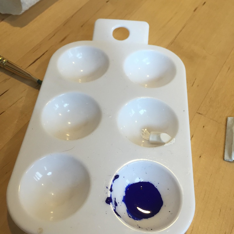 | 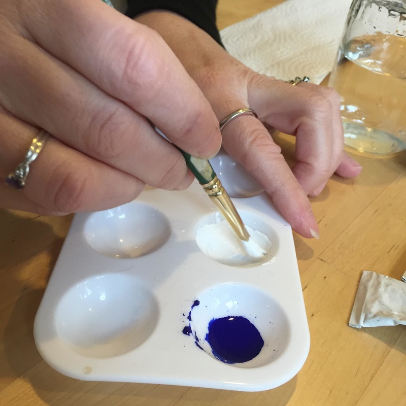 |
Once the blue is mixed, clean out the mixing brush thoroughly using soap and water or get another toothpick. Dry the brush and start mixing the white the same way that the blue was mixed.
Voila, paint.
One should not use the paint as it comes out of the tube. Unless for some crazy reason the color matches perfectly, an artist will need to mix up matching colors. We will discuss color matching later in this blog.
Take some of the blue and divide it into two more wells in your paint tray. Then add one portion of white to one, two portions of white to the second, and three portions of white to the third.
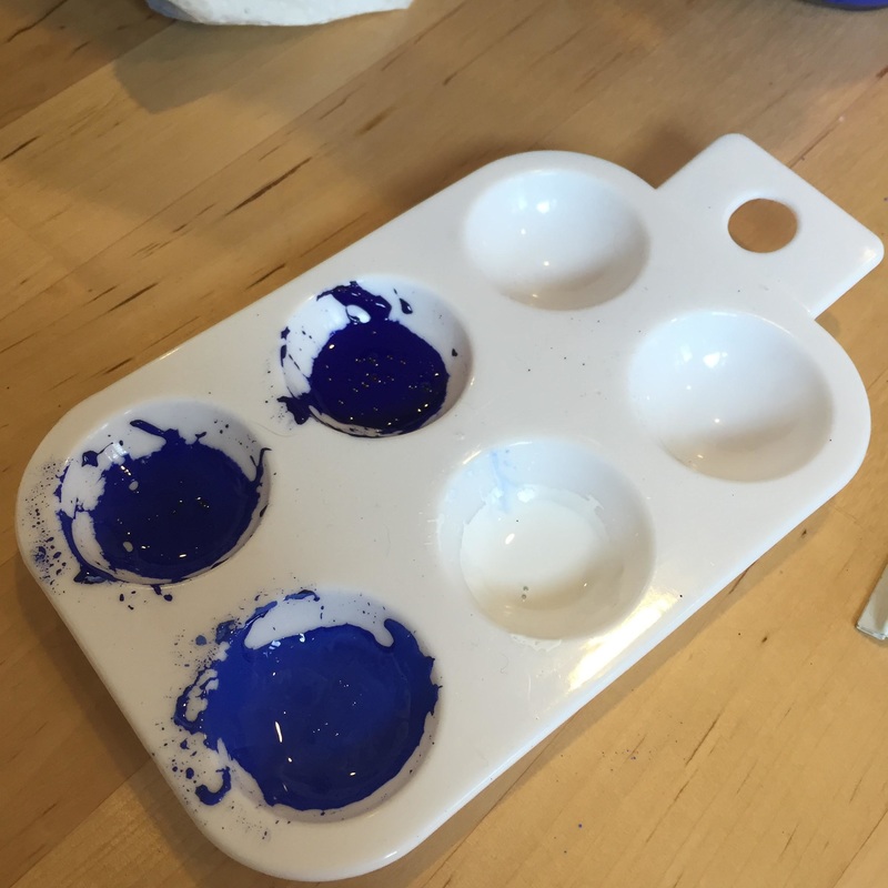
This will produce three shades plus your white.
This procedure will allow for practice in portioning colors and mixing. Always make sure that the paint is the consistency of light cream. If it start to get thicker, add water. This will happen over time as the paint drys normally. I found that during the winter (when the humidity of the air is lower) that the paint dries in the paint tray very quickly, so I will continue to add water as I paint.
Start practicing painting:
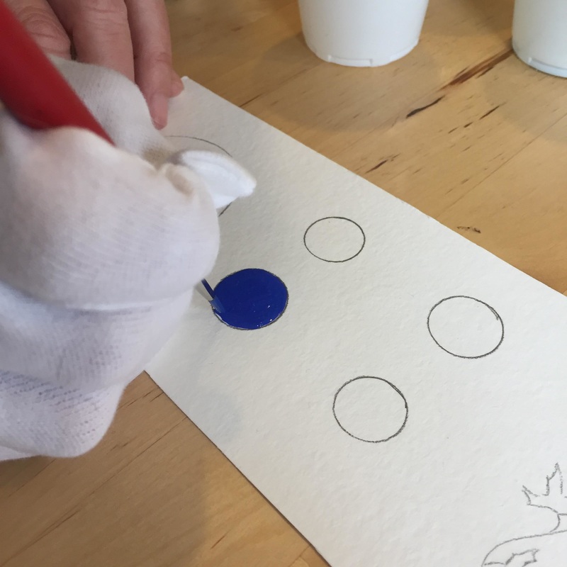
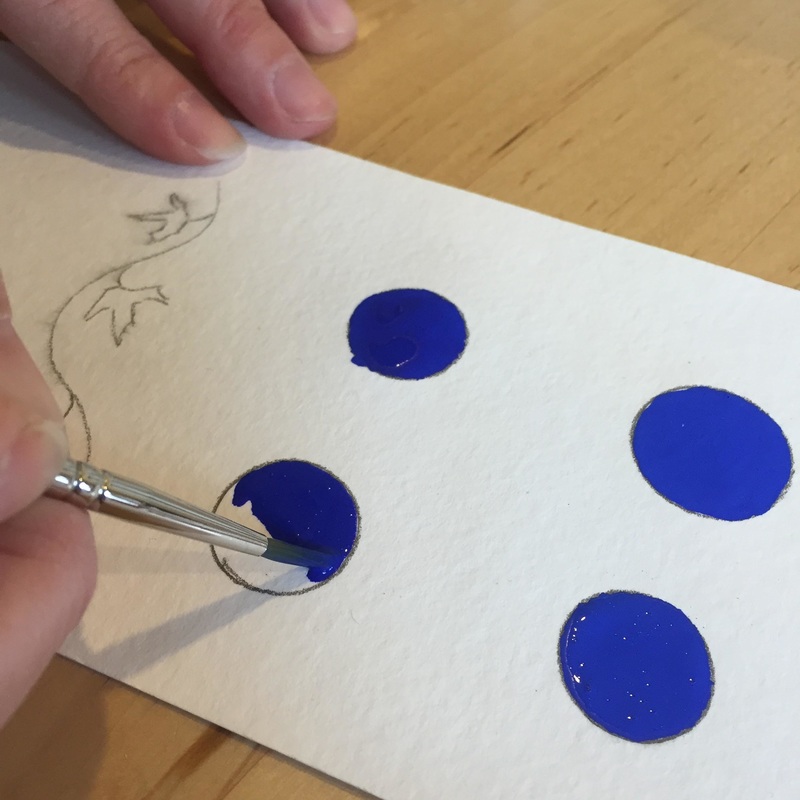
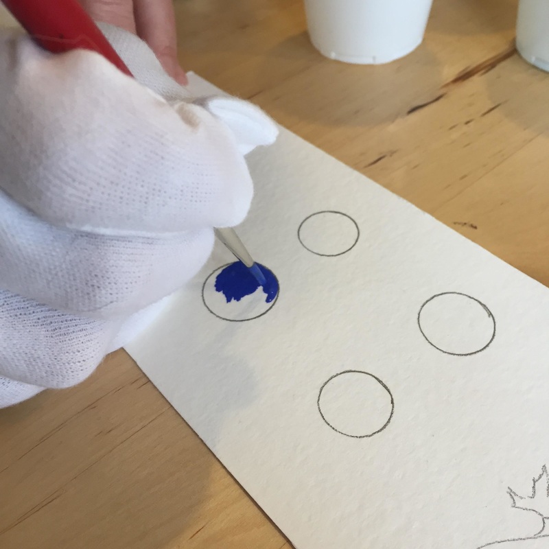
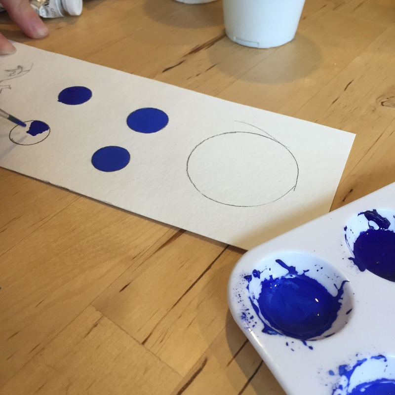
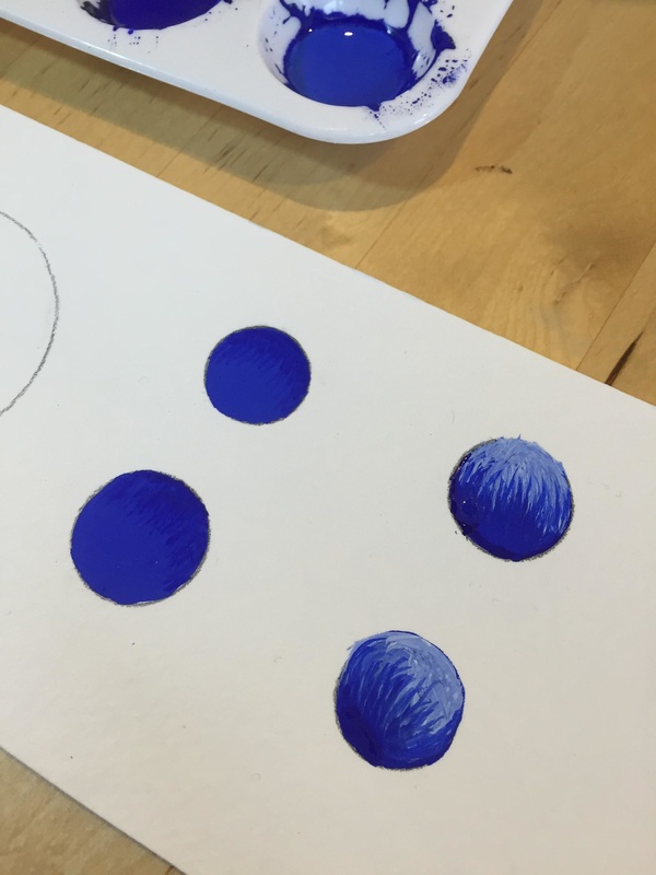
First make some circles on a piece of paper. Make sure water is added with the pipette if the paint is beginning to dry up. Dip the brush into the paint, getting a decent amount of paint on the brush. This is called filling the brush. Wipe off the brush on the way out of the paint tray. With the brush at a 90 degree angle to the table, start to lay the paint down with the tip of the brush. The procedure is to work wet on wet. It is always a temptation to outline, but don't do it. What should be felt is that the paint is pulled to the places that the artist wishes it to go. This will sometimes make the brush change the angle, but try to maintain the upright angle with only the tip coming in contact with the paper. Try not to drag the brush. The tip should glide across the paper. If it feels like it is scratching the surface, refill the brush with more paint. Continue to work from one side of the circle to the other until it is full. Then let the paint dry. The paint should look like smooth glass if you have done this right.
What will be seen is a couple of things. Paint dries unevenly so watching the paint dry can be educational. That does not mean that the procedure was done incorrectly, only that artists need to wait until the area dries completely. Some cautions. Don't try to repaint over areas that look uneven at this point. Re-painting will make those icky brush strokes that are to be avoided. Wait until it dries completely and then assess. If the procedure has been done correctly (filling your paintbrush, wet on wet, making sure that the paint is still cream consistency) the paint will dry in a consistent color with no brush marks.
Things to look for: If you have bare patches, or little spots where the paper can be seen, you probably didn't have enough paint in your brush or the paint was too wet or too dry. If brush strokes can be seen, the paint was too dry, or the brush was not in the 90 degree angle to paint.
Repeat the exercise with the remaining circles. Remember the mantra, fill the brush, 90 degrees, wet to wet, rewet the paint.
This procedure will allow for practice in portioning colors and mixing. Always make sure that the paint is the consistency of light cream. If it start to get thicker, add water. This will happen over time as the paint drys normally. I found that during the winter (when the humidity of the air is lower) that the paint dries in the paint tray very quickly, so I will continue to add water as I paint.
Start practicing painting:
First make some circles on a piece of paper. Make sure water is added with the pipette if the paint is beginning to dry up. Dip the brush into the paint, getting a decent amount of paint on the brush. This is called filling the brush. Wipe off the brush on the way out of the paint tray. With the brush at a 90 degree angle to the table, start to lay the paint down with the tip of the brush. The procedure is to work wet on wet. It is always a temptation to outline, but don't do it. What should be felt is that the paint is pulled to the places that the artist wishes it to go. This will sometimes make the brush change the angle, but try to maintain the upright angle with only the tip coming in contact with the paper. Try not to drag the brush. The tip should glide across the paper. If it feels like it is scratching the surface, refill the brush with more paint. Continue to work from one side of the circle to the other until it is full. Then let the paint dry. The paint should look like smooth glass if you have done this right.
What will be seen is a couple of things. Paint dries unevenly so watching the paint dry can be educational. That does not mean that the procedure was done incorrectly, only that artists need to wait until the area dries completely. Some cautions. Don't try to repaint over areas that look uneven at this point. Re-painting will make those icky brush strokes that are to be avoided. Wait until it dries completely and then assess. If the procedure has been done correctly (filling your paintbrush, wet on wet, making sure that the paint is still cream consistency) the paint will dry in a consistent color with no brush marks.
Things to look for: If you have bare patches, or little spots where the paper can be seen, you probably didn't have enough paint in your brush or the paint was too wet or too dry. If brush strokes can be seen, the paint was too dry, or the brush was not in the 90 degree angle to paint.
Repeat the exercise with the remaining circles. Remember the mantra, fill the brush, 90 degrees, wet to wet, rewet the paint.
   |   Let the paint dry and examine your work. This technique does take some practice but once you get the hang of it, it will yield really nice results. While you are taking a break for the paint to dry, now you can start working on a technique for paint matching. Take a small square of paper. Dip your brush in the darkest color you have and make a small mark of paint on the edge of the paper. Let it dry. Clean your brush and dip your brush into the next shade of color you have and make a small mark of paint on the edge of the paper next to your previous paint mark. Repeat the process with each shade of paint that you have made. It should look like the picture below when you are finished. |
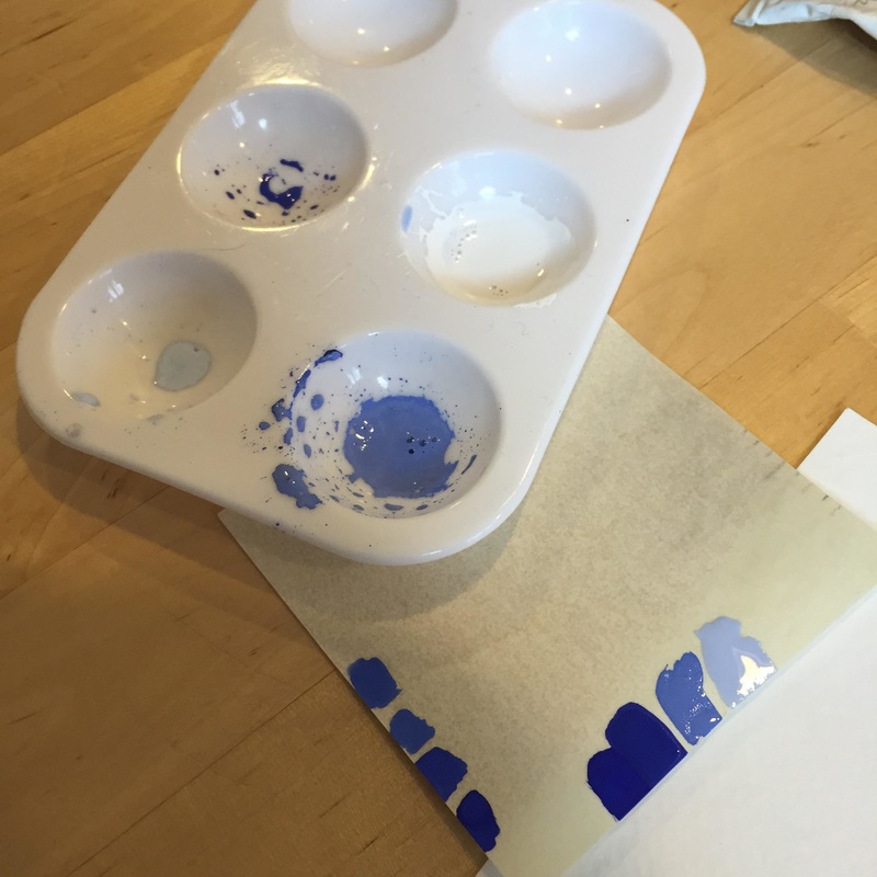
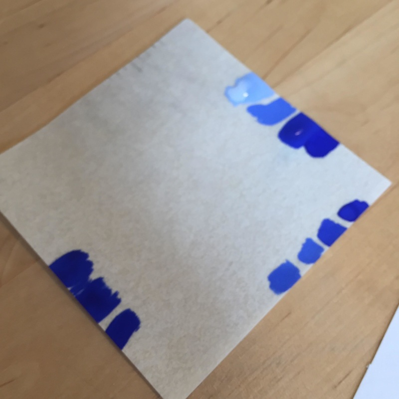
For color matching, start with an estimate/guess of the correct shade to the original adding white, black, grey, or a complimentary color (see color wheel for more information on colors to add in order to match a particular color) and make the paint marks. Continue to add white, black, grey or complimentary color a little at the time and paint each shade on the edge next to the previous shade. This will do two things. The color change will be clear, and you can tell what is color needs to be added next. Each shade is then painted on the edge, and the edge is easily put next to your original to see if it matches. Color match after each change in shade.
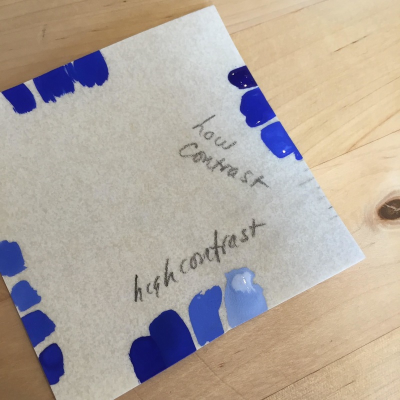
Also for shading, to make different tones of the shades needed there is either high contrast or low contrast to chose from. (This website explains nicely the difference between hue, tints and shades). The picture below shows the difference between low contrast and high contrast for shading. Which is chosen depends upon the original source material.
Also for shading, to make different tones of the shades needed there is either high contrast or low contrast to chose from. (This website explains nicely the difference between hue, tints and shades). The picture below shows the difference between low contrast and high contrast for shading. Which is chosen depends upon the original source material.
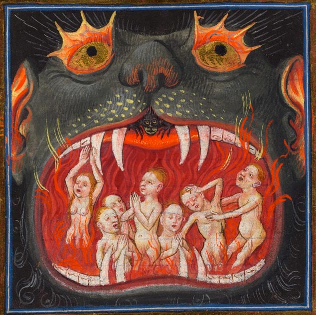
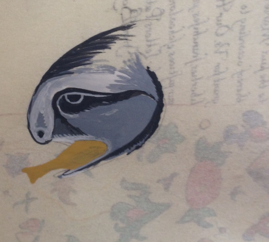
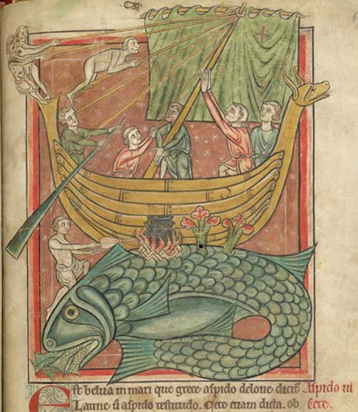
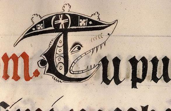
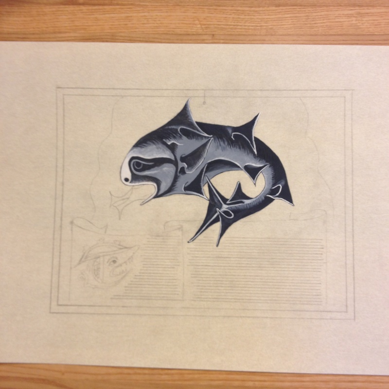
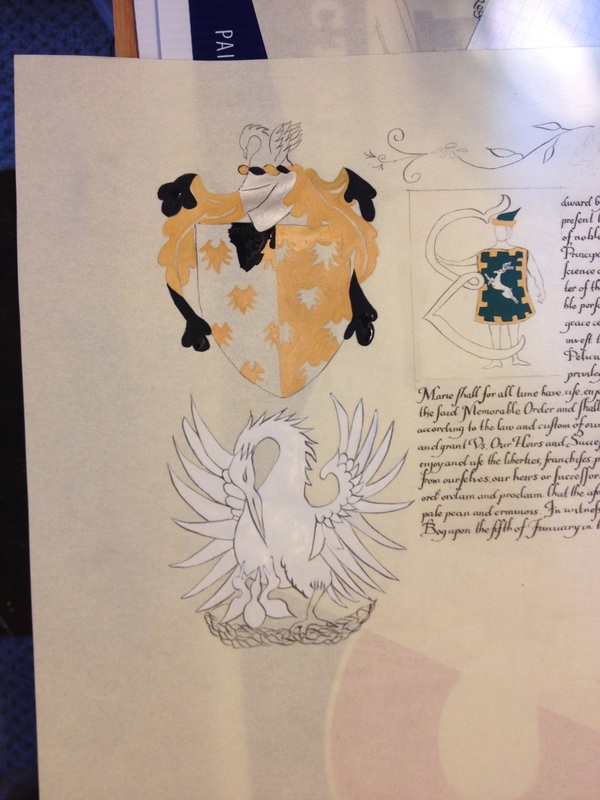
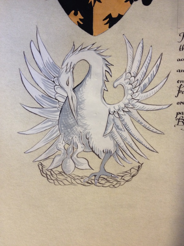
Time to lay down some shading. There are several ways to do this, but one method that is used by medieval artists is the idea of shading with lines. Look closely at the below example below of the demon illuminated from A Hellmouth Structure from the "The Hours of Catherine of Cleves" 1440. All of the shading is by very fine lines.
So now to practice the technique.
The circles of paint have dried, now you are going to use a lighter shade and paint tiny lines.
The circles of paint have dried, now you are going to use a lighter shade and paint tiny lines.
The circles on the left side have darker shade at the top, and the circles on right shade have lighter shades from the top to a darker shade on the bottom. Again, practice, practice, practice.
To go over the highlights:
Paint - consistency of light cream
Fill paintbrush with paint
Paintbrush in 90 degree perpendicular to the surface, with only tip coming in contact with paper
Add water when paint starts to dry out
Wet on wet technique
Use of lines to shade.
Good luck!
Paint - consistency of light cream
Fill paintbrush with paint
Paintbrush in 90 degree perpendicular to the surface, with only tip coming in contact with paper
Add water when paint starts to dry out
Wet on wet technique
Use of lines to shade.
Good luck!


 RSS Feed
