Once I was started, I did get up quite a head of steam, so I forgot to take pictures between transitions such as inking, gold, and color. Sometimes that just happens.
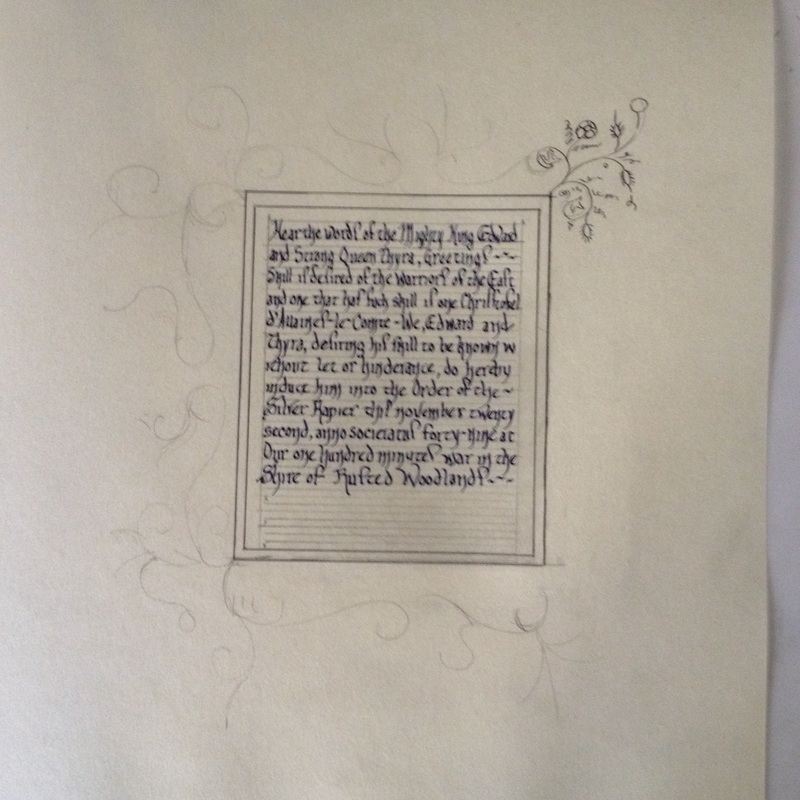
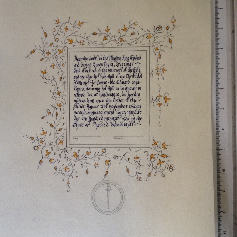
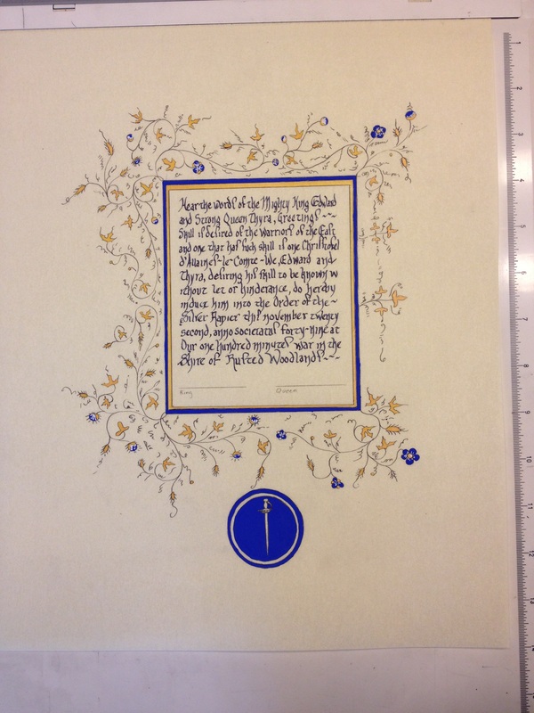
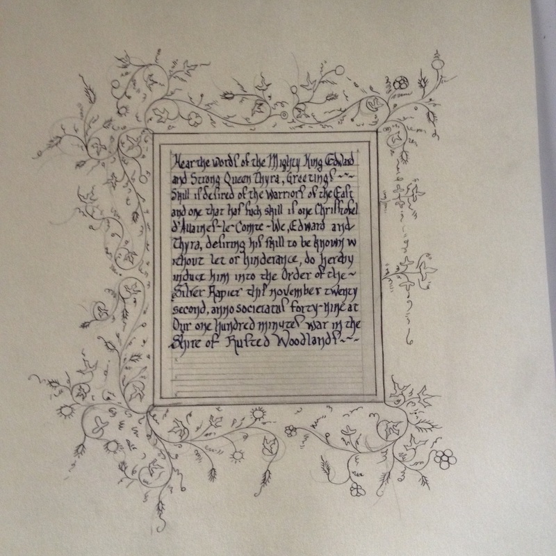
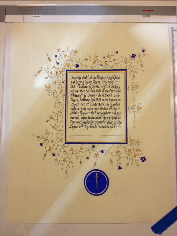
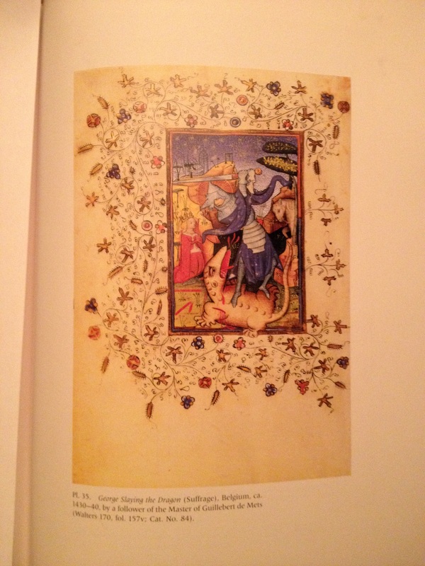
| Layout done, calligraphy practiced (for hours it sometimes seems) and then put onto scroll. Inking started on design. Suddenly remembered as I was doing the top right ivy that I hadn't taken a picture yet, and zoom, take picture. Continued experimentation with SnS2, stannic sulfide, which is mosaic gold and was actually used in period manuscripts. I'm getting better at laying it down and it does have a nice bit of a shine, although, I don't think you can see it here in the picture. You can also see that I remembered to put the badge in. Final details, white to give the flowers dimension and the project is finished, ready for cut sheet and packaging. I include the wording and research information below: Wording: Silver Rapier for Christoffel d'Allaines-le-Comte called Christoffel d'Allaines-sur-Comte Hear the words of Mighty King Edward and Strong Queen Thyra, Greetings, Skill is desired of the warriors of the East and one that has such skill is one Christoffel d’Allaines-le-Comte called Christoffel d’Alaines sur-Comte. We, Edward and Thyra, desiring his skill to be known without let or hindrance, do hereby induct him into the Order of the Silver Rapier this November twenty-second, Anno Societatus forty-nine at our One Hundred Minutes War in the Shire of Rusted Woodlands. Words, Calligraphy and Illumination by Nataliia Anastasiia Evgenova Reference: George Slaying the Dragon, Belgium, ca 1430-1440, by a follower of the Master of Guillebert de Mets (Walters 170, fol. 157v; Cat. No. 84) | Inking done. Step back and breathe. I had put an initial layout of where I wanted the design to be and where I wanted it to mirror, however, I tend to not put in every single detail. I do let the ink and the paper tell me what it wants. And it usually is right. I also decided to go a little less busy than the original piece to give it a more delicate nature. Period pigment, Lapis Lazuli, which I had from a previous project. The blue is so nice. You can see that I laid out mosaic gold on the interior of the box, and then the blue on the exterior to make it pop out more and to relate to the order badge below. While I make sure that I look at the work with medieval sensibilities, I also acknowledge that this is a gift to a friend and an art piece that needs to stand on its own. Thus making sure that it has balance. Picture of original piece. I found myself in an unusual circumstance. I had taken the source from one of my myriad of art books. I decided to look it up on the web and I could not find it on the web. With the new digitization of just about everything which is a wonderful thing for many scribes doing research, I was very surprised not to find it. However it did give me quite a few hits on some research behind this particular piece that will have to wait for yet another day. So I went old school and took a picture. And for good measure the bibliography: "Time Sanctified: The Book of Hours in Medieval Art and Life, Wieck, George Brazillier, Inc., New York, in Association with the Walters Museum, Baltimore, page 143. |
 RSS Feed
