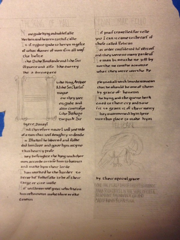
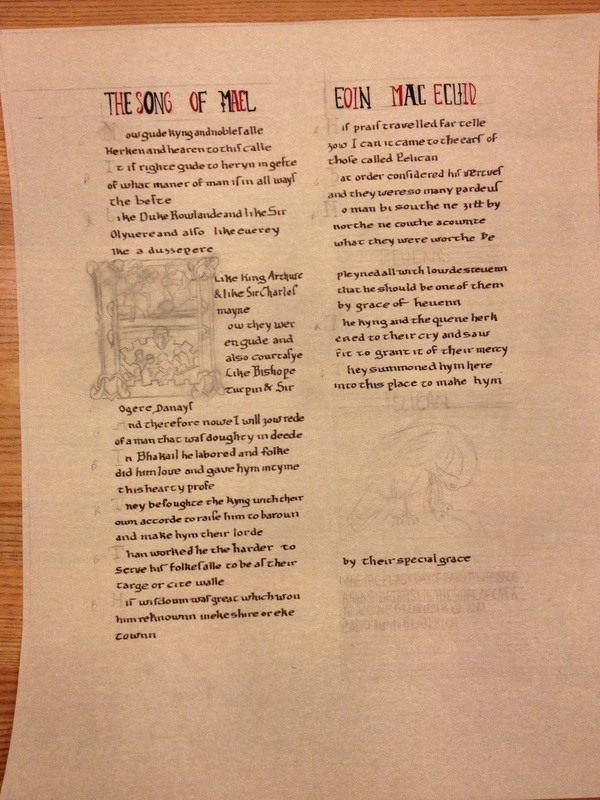
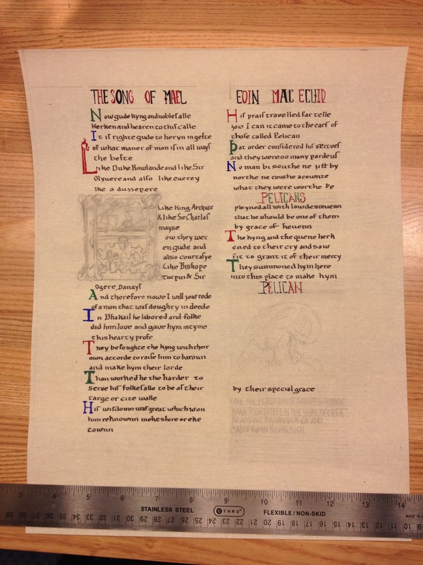
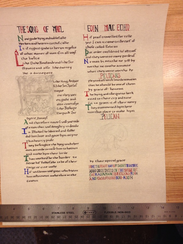
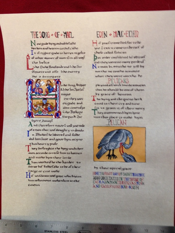
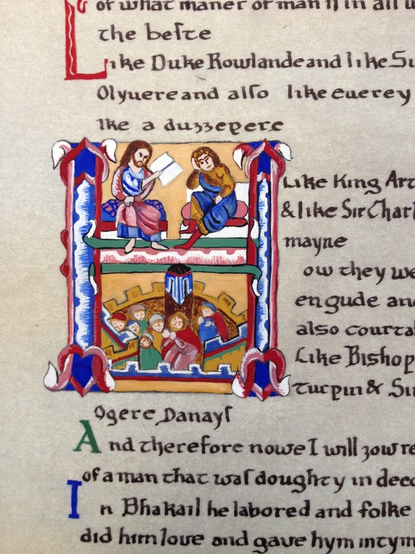
Painting
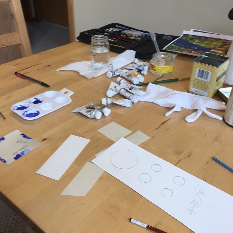
1 Materials
2 Before you begin
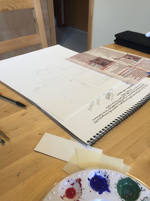
1. Clear surface to paint. Either have a flat or angled surface, but it must be free of things. I clear the entire table for working and then slowly, but surely, things collect to me. Paint, brushes, water, paper. So start with a clear surface.
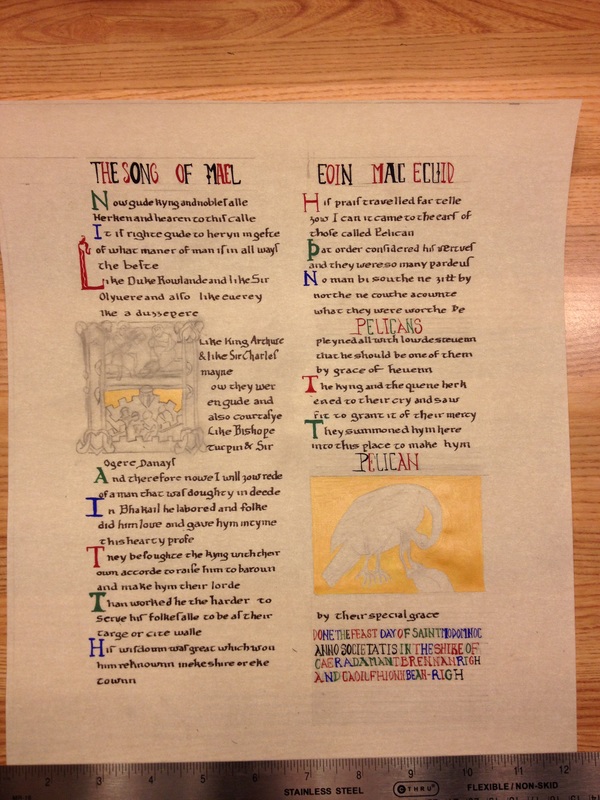
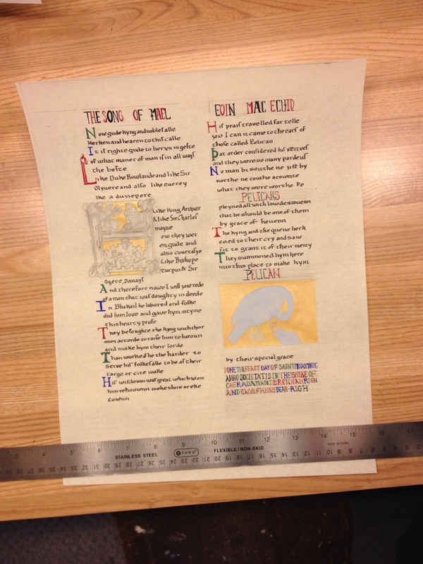
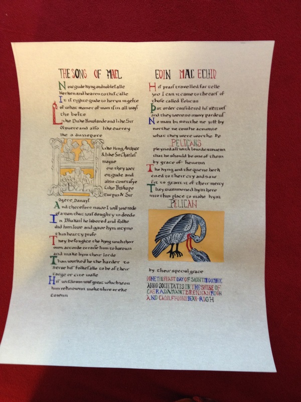
2. Research the subject for the project. Produce a layout. Do the layout several times to make sure that the layout is pleasing. Once painting begins it is more difficult to change. Not impossible, but challenging.
3. Lightly draw the art. If appropriate, use pen and ink to outline. One rule - crown quill pen and ink to outline prior to painting, black paint with a thin brush or crow quill pen after painting. If ink is used after painting, the ink bleeds.
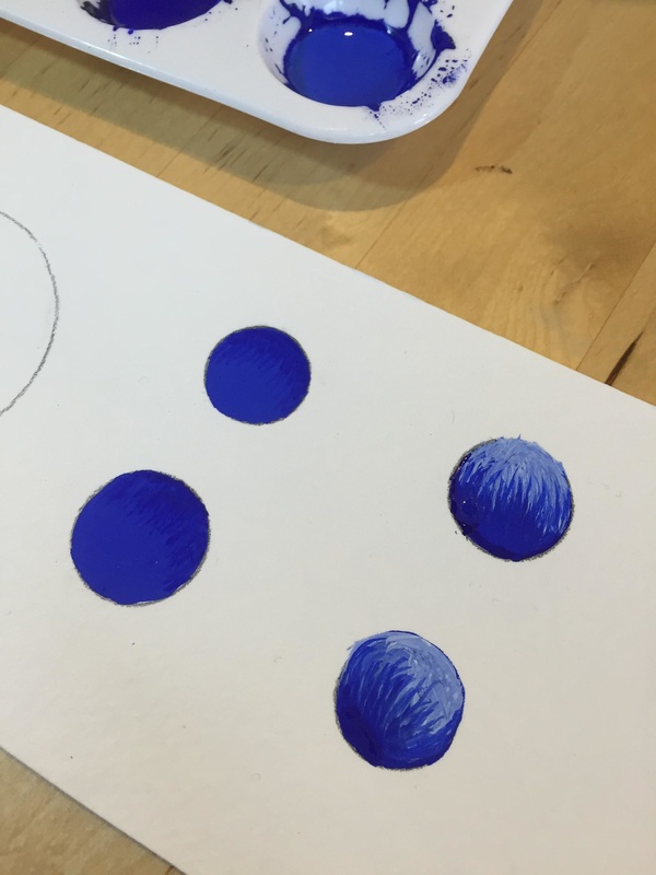
3 Step one - Mixing
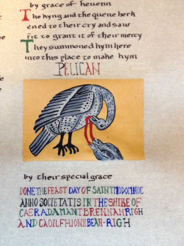
4 Painting
5 Color matching
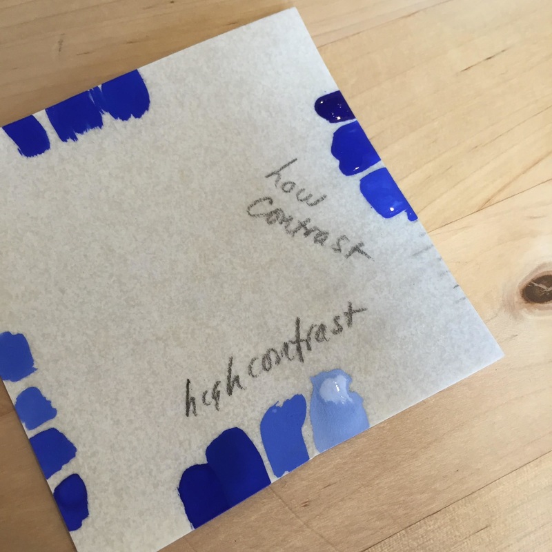
6 Shading
7 Highlights
8 Where to get materials
1 Materials
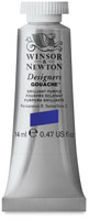
- Windsor Newton Ultramarine
- Windsor Newton Permanent White
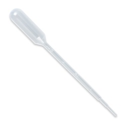
- 3 or 4 pipettes (A pipette or dropper is a laboratory tool commonly used in chemistry, biology and medicine to transport a measured volume of liquid)
- glass container of distilled water
- 2 glass containers of water to clean brushes as you work
- mixing brush or toothpicks
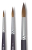
- painting brush
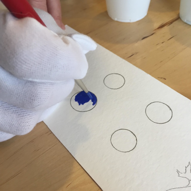
- white glove with thumb and first finger cut out
- paint tray
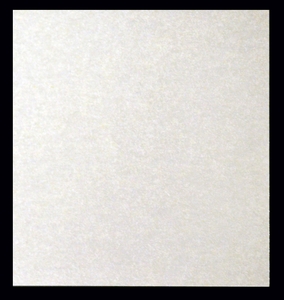
- paper (Pergamenata, Bristol Board, Opaline Vellum)
2 Before you begin
1. Clear surface to paint. Either have a flat or angled surface, but it must be free of things. I clear the entire table for working and then slowly, but surely, things collect to me. Paint, brushes, water, paper. So start with a clear surface.
2. Research the subject for the project. Produce a layout. Do the layout several times to make sure that the layout is pleasing. Once painting begins it is more difficult to change. Not impossible, but challenging.
3. Lightly draw the art. If appropriate, use pen and ink to outline. One rule - crown quill pen and ink to outline prior to painting, black paint with a thin brush or crow quill pen after painting. If ink is used after painting, the ink bleeds.
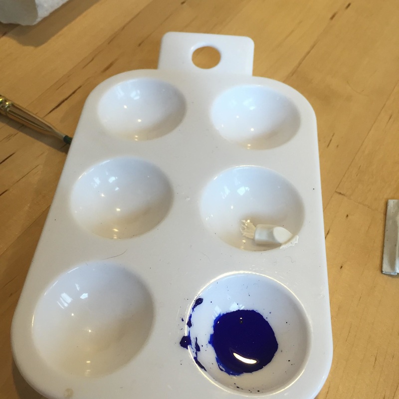
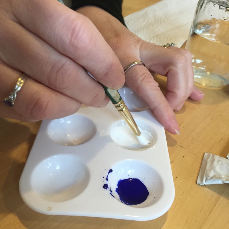
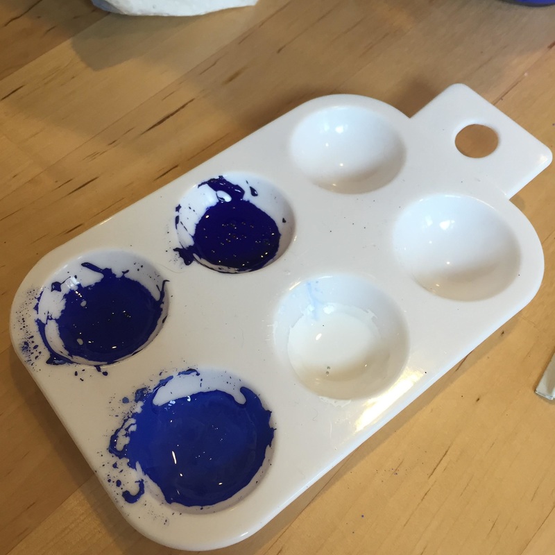
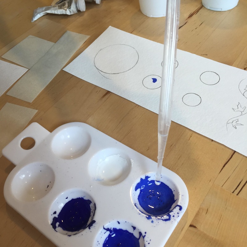
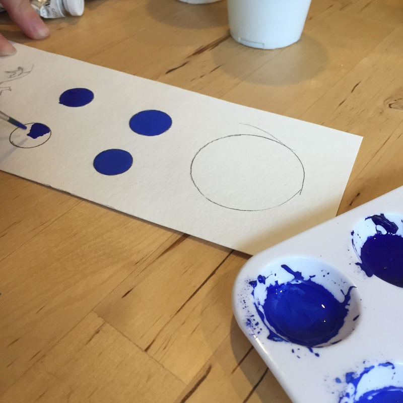
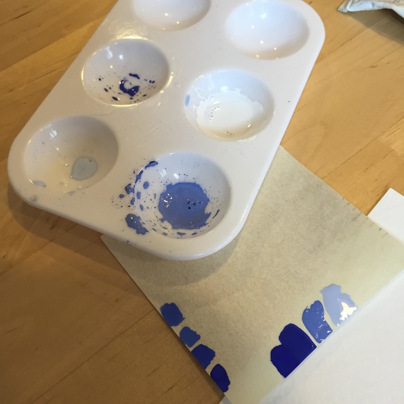
3 Step one - Mixing
- Mixing paint
- Consistency -light cream
- Use pipettes
- Dividing up paint to make shades
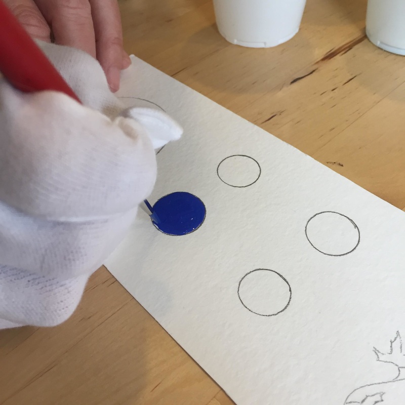
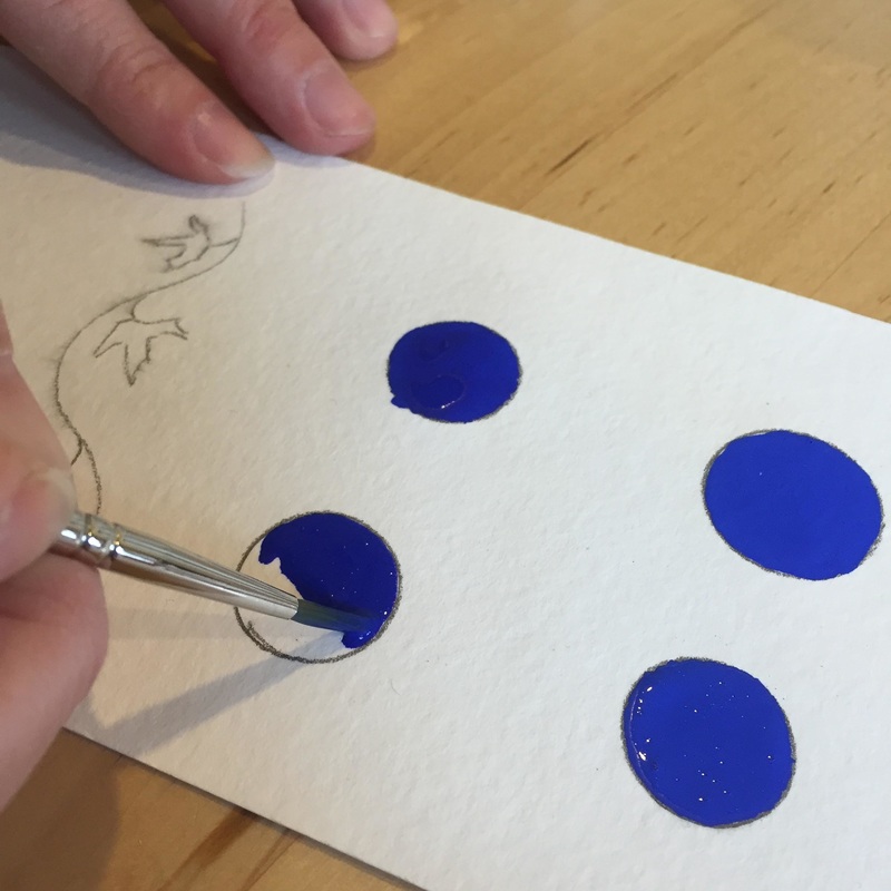
4 Painting
- 90 degree angle of paint brush to table
- Fill paint brush with paint, brush excess off
- Use only tip
- Don’t drag brush
- Wet on wet technique
- Don’t go back over places where you have painted
- Rewet the paint as needed so that it stays consistent
- Let the paint dry and examine
- Practice, practice, practice
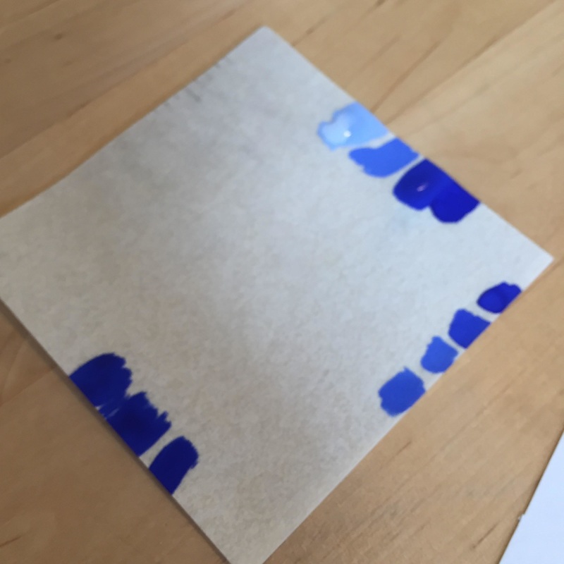
5 Color matching
- Paper swatch
- Shades
6 Shading
- Practice shading technique
- Base color must be completely dry before starting shading technique using lines
- Base color can be wet for blending technique
7 Highlights
- Paint - consistency of light cream
- Fill paintbrush with paint
- Paint at 90 degrees with just tip
- Add water when paint starts to dry out
- Wet on wet technique
- Use of lines to shade
8 Where to get materials
- Paper Ink and Arts http://www.paperinkarts.com/
- Dick Blick http://www.dickblick.com/
- Scribblers www.scribblers.co.uk
- John Neal Books http://www.johnnealbooks.com
 RSS Feed
