Arts Nataliia
  • Home
  • My Art blog
  • Interesting blogs
  • More Art to Look at
  • Students
    • Student: Leonete d'Angly
    • Student: Cezilia Raposa

How to get started in art/scribal/calligraphy/illumination

1/28/2015

0 Comments

 
Picture


I've heard from enough people that there seems to be a demand for the basics on how to get started doing scribal activities.  This is mostly directed at people who are in the Society for Creative Anachronism, but can probably be applied to anyone who wants to start doing art in their life no matter what.
So let's go!

Materials


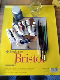
So to start off, you should go out and purchase the materials that you will need.  I have spoken about this in a previous post here.   I have updated it with links of the materials that I recommend.  That doesn't mean that you have to buy these products from Dick Blick, etc., but it gives you an idea of what you are a looking for.   Some of the materials are readily available on Amazon, in craft stores such at Michael's and A.C. Moore and Jo Ann's Fabrics.  Compare prices and always go with professional grade over student grade.  If you have a budget, and everyone does, buy only a few things to get you started, the minimum that you should have is some paints, some ink, some brushes, some paper, pencils, paint tray and some pens (crow quill and calligraphy), paper cups for water.    You will also need a container for these things.  Any bin will suffice and you can go as fancy or as utilitarian as you like.  Eventually you will outgrow it once you get hooked, but at first you will want to have a clean storage bin for your materials.

Resources/Research

Picture
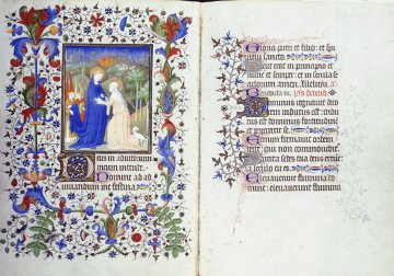
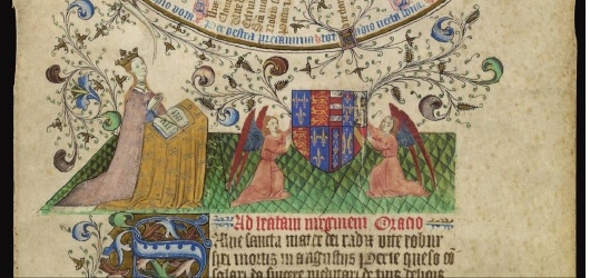
Above:  Hours of Etienne Chevalier, 160 x 115 mm, c. 1420, Visitation, illuminated by the Master of the Boucicaut Hours


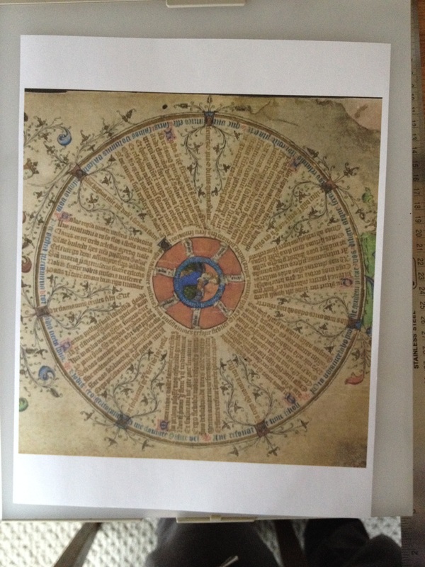
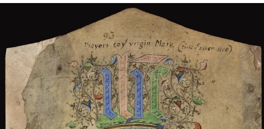
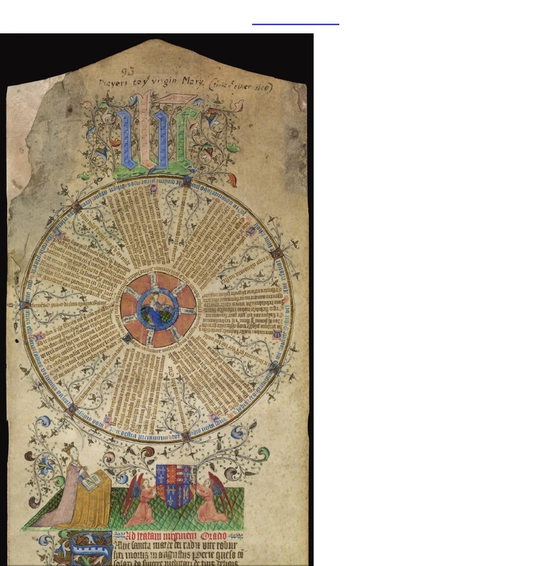
Before you start, take a look at artwork during the time between 500 A.D. to 1603 A.D.  There are quite a few books out there that show you photographs of the art, but the internet has exploded with examples.  One quick google search of "16th Century illuminated manuscripts" and click on images will give you scores of examples to look at.  You do have to be careful and make sure that it is not someone's artwork that they have made such as printables or reproductions or someone's award scroll that they have made.  Look for date, attribution and even the website where it is from.  There are a lot of colleges, museums and libraries that are now making digitized manuscripts available for those interested in that type of research so they are out there.  Find something that you like, that you believe to be in your ability.  It doesn't have to be the whole exemplar, it can be just a small part of it that is interesting to you, such as the initial letter, some pretty vine work, or a background design.  Print it out for yourself to use while you draw and paint.

Ready, set..........


Find yourself a clean space to work.  It should have sufficient light.  Your first couple of tries are just to get comfortable with the materials.  Get a pencil, brush, the paint you are going to try, a crow quill pen, black ink, water for cleaning your brush, distilled water for adding to the paint, a pipette or eye dropper and paper.

Have what you are copying nearby.  I usually stick it up with my blue painter's tape on the mirror right in front of me, but do what works best for you.

With the pencil, sketch out your piece.  The first one should be fairly simple.

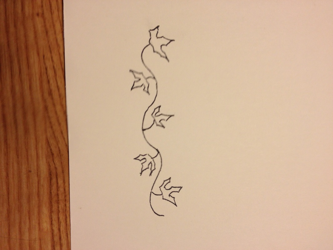
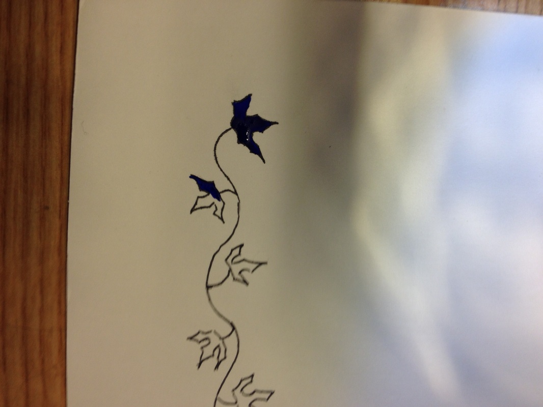
The picture on the left is just a pencil drawing of vine and leaves on 100 lb bristol board.  I used Higgins eternal and a crow quill pen to outline the vine and leaves (middle picture).  As you can tell, the picture on the right shows that the ink is not exactly over the pencil lines and that is perfectly okay.  The pencil is a guideline.  You will be erasing those lines in a minute.
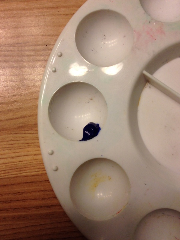
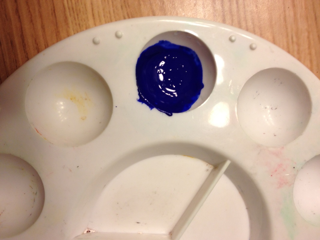
While you wait for the ink to dry, you can mix your paint.  I am going to go straight with out of the tube for right now, while we figure out how to actually paint.  Once we get beyond the mechanics, I will talk about color matching and mixing paint.  But not yet.  Put a little bit of paint into your paint palette and using a pipette or eye dropper add one drop of water.  Mix the paint with a mixing brush or toothpick (shown in middle) and check the consistency.  You keep adding one drop of water until the paint is the consistency of cream and should look like the paint on the right.

If the paint is too dry, add water, if it gets too wet, either add a little paint, or walk away for a while so that the paint dries a bit.   This part may take some practice.  That is why you use a pipette and put in one drop of water and mix.  For the paint above it took three drops of water to get the right consistency.
Take your plastic white eraser and go over the inked vines and leaves.  Ink dries fairly quickly and it should be dry by the time you are done mixing the paint, but you can check by testing it with a finger on an edge.  When dry, erase.  Next step - start painting.  Fill your brush with paint and start at one corner of the leaf and work out toward the rest of the leaf, always painting wet on wet.  Your paint brush should be perpendicular to your work and you should be painting with ONLY the tip.  Lay a little bit of paint down, and then pull the paint across the paper, then get more paint.  For the leaves above for each leaf I dipped by paint brush three times so that should give you a guideline.

I try to work from left to right or top to bottom so that I don't end of putting my hand/arm across already wet paint.  Don't go back over the paint once you have set it down as this will cause streaks.  Let is dry and then check your work.  It should look all one color and smooth. 

You will need to do this a couple of times in order to get the hang of it.

Please post in the comments if this is helpful, what questions you have, and what you would like to see next.

0 Comments

Birka - 1/24/2015 - Order of the Golden Rapier - Lucien

1/25/2015

0 Comments

 
Golden Rapier for Lucien de Wyntere

This was a super secret project for my own cadet Lucien.  I received the news of his elevation 3 months before it was going to happen so I had plenty of time to paint to my heart's content and do it up something nice.  And it was done early so that it could go to the royals for the special signature in white ink.  This is the piece of artwork that I kept track of in my "So how long does an artistic piece really take?" which came to 16 hours.  My cadet was worth it.

So I worked on the words first which I based on the 
Charter to Sir Walter Raleigh: 1584 which you can find here.   The Avalon project is really great for actual documents during the historical period that I am studying. I adjusted it for the needed content, kept the period spelling and viola.

Edward, and Thyra by the good Grace of the East, defenders of the realm, to all people to whome these presents shall come, greeting:

Knowe yee that of our especial grace, certaine science, and meere motion, we haue given, and by these presents for us, our heires and successors, for great skill and willingness to defend our selues from harm, we giue to our trustie and welbeloued seruant as our will and pleasure is, and wee do hereby declare that Lucien de Wyntere, be inducted into the Order of the Golden Rapier. In witness whereof, we haue caused these our letters to be made and Witnesse our selues, at Birka, the 24th. day of January, in the nine and fortieth yeere of our Society.

I did the words, the calligraphy and the illumination.  The calligraphy is getting easier, and the white ink is not fighting me as much.  I also used several practice sheets of the black paper to make sure that the flow was right. 

I chose for the illumination the Sforza Black Hours, by Master of Anthony of Burgundy, 15th Century, illumination on parchment.  You can find it here and here. I also have several of my own books with sample pages of the Black Hours, so I used several elements.

So I start with the finished product.
Picture
But let's go back to the beginning.  Black 240 pound paper.  Pencil layout.  Several practice sheets, and I was able to create the calligraphy for the final piece below.  You can just barely see the pencil sketch for the overall illumination and portrait.
Picture
I wanted to set the words apart, so I encased it in a mosaic gold arch.  This is a better photo of the pencil sketching that has the general design as well as the portrait.  I also started the layering process with the portrait of Lucien.  This was taken from one of his online portraits, with his signature hat.
Picture
I worked on the portrait details, putting Lucien in a white shirt to have the white start moving about the page.  The next step was the Golden Rapier badge in lapis lazuli.
Picture
I used a crow quill pen to make vines move all over the page, using mosaic gold painted on to the quill.  With the portrait and badge, it was now time to move to all of the beautiful floral decorations.  I alternated with the mosaic gold, white and burnt umber starting with the leaves, after I had laid the layer of the vines.
Picture
I started at the bottom and worked up, alternating the colors as I went.
Picture
Large floral leaves all the way around the border of the calligraphy, with some flourishes of bulbs and flowers.
Picture
Next came the white leaves, and then I added green leaves around the Golden Rapier badge and throughout the design to lead the eye from portrait, to the top, and then back down to the badge.
Picture
Final details, let the art rest and boxed up for shipment with instructions on the special white ink signatures.  I also sent some extra black paper for practice as I know how nerve wracking it can be at this point when you worry that one problem is going to ruin a beautiful piece of art.
Picture
0 Comments

Dosalena - Maunche scroll

1/22/2015

0 Comments


Twelfth Night Scroll - 1/17/2015

There is a wonderful artist who lives in New York that I am so pleased to be able to call my friend.  A Real, Live, works for a living artist.  Her maunche was approved, and I quickly asked for the commission.  At the time I knew that I wouldn't be able to be present because we had already booked and paid for a vacation trip to St. Thomas for the weekend of Twelfth Night, when it would be awarded, so I wanted to do something spectacularly nice for her.

And I think it worked. :-)

Fi
rst the inspiration:  Illumination based on the Prayer Roll for Queen Margaret of Anjou 1445.  I could not find it online anywhere, so I took several pictures of it with my phone camera and then printed out several copies to post on the mirror of my drawing area.

Picture
Picture
Picture
I liked several of the elements, but I wasn't going to include them all, but having the entire exemplar was helpful in choosing the right color schemes and details.

It was time to start the drafting of my art.

Picture
More practice pieces, more drafting, including practicing the layout of the calligraphy (seen above).   This was going to be a stretch for me.  Not only was this a much longer piece of wording than I usually do, it was not a traditional layout.

I chose to focus on the center of the prayer roll from the original, and not the entire prayer roll with the figures and initials at the top.  I made this decision after doing several mockups with the figures, pulled a picture of Guild Mirandola from Pennsic to see if I could fit it in, and doing some sketches.  It seemed very natural to place the Maunche badge in the middle with all roads (words) leading to the Maunche.

You will see that I eventually changed the way that the calligraphy fit as all the words actually ended up fitting in the prayer roll once I laid it out.

Picture
Layout on the pergamenta.
Picture
Mocking up the wording.  I wanted to practice this more to make sure it would work. 
Picture
Calligraphy of the main text following the layout of an actual prayer roll.  As usual, once I get "arting" I forget to take breaks and take pictures.  On the one above, I laid out the black ink, the lapis and the mosaic gold for the smaller initial letters.
Picture
Next is the leaf and vine.  The original has a little less symmetry, and I made a conscious decision to be more symmetrical.  I also changed my original design a little to put mini leaves around the maunche medallion.  I had seen examples of that type of design in other exemplars, so it wasn't out of place.  It also artistically helped the eye scan from outside to the inside.  I also inked in the Maunche medallion.
Picture
Another layer of mosaic gold.  You can read about mosaic gold in my previous blog posting.   I painted the exterior and the leaves with the mosaic gold.
Picture
Then I moved to the center for the Maunche badge.  I needed two light coats to give it the right look.
Picture
I added the purple for the Maunche badge, and added more lapis around the outside initial letters.
Picture
The final details around the initial letters of a beautiful russet red.  I applied the paint to the crow quill pen that I use for that level of detail.  It needed to be especially careful to get the right consistency for flow through the pen.  Too much liquid/water and there were spots on my practice sheet, too little and it did not flow properly. I then added white to the exterior initials on the exterior gold circle.  This punched up the design also, adding another level of detail.  Still wanting to add more depth to the vines themselves, which is true to the original exemplar, I took a lovely malachite that I had to just add a dot of light green to the vines.

After erasing all the lines that were left, I put in two lines for signature and it was ready to be packaged and sent off to the King and Queen for presentation.

I have heard that these pictures do not do it justice and that the recipient was quite surprised and delighted.  That makes me a happy artist.
0 Comments

Patronage - an idea

1/10/2015

1 Comment

 
So I continue with my discussion of the little startup idea of Patronage.   I've discussed it on my google plus account with like minded people from time to time and what I have found is that I do have to explain what I am talking about as new people join me on thinking about the idea.   So my thought was to put the concept down in writing and then direct people here.   This accomplishes two things; it makes me actually put down my thoughts in writing and that way I can continue to process it and add or subject to the concept and I can direct people to this explanation.

I'm going straight with the medieval idea of patronage:  "Patronage is the support, encouragement, privilege, or financial aid that an organization or individual bestows to another. In the history of art, arts patronage refers to the support that kings, popes and the wealthy have provided to artists such as musicians, painters, and sculptors." Wikipedia     I want to encourage this within the non-profit recreation group of the Society of Creative Anachronism.

My idea is that if people are interested in promoting a certain thing, for example: more music in the SCA, better heraldry, more research in a particular time period, then they would either through resources, financial or otherwise, assist an aspiring person in the SCA that would benefit from that patronage. 

The idea of Patronage seems to resonate with people because it is something that their personna would do as nobility.  My personna that is the artist and fencer would have had a patron who I wrote for, painted for, trained.

Ideally, what patronage can be is:

1.  "I want new fighters to look better so I'm going to commission some new fighting tunics and donate them to people".

2.  I want to give a scribe paints to get started.

3.  I want fund artists/scribes who want to do things with more medieval materials.

4.  I want to hear more periodic music at SCA events.  I will commission someone to do this.

5.  I want to see more research done on 16th century Italian culture.  I will assist a person by helping them get books, or work with them at one event to show them where the best research is.

6.  I love heraldry and I would like to encourage someone to do more with heraldry.

7.  I want X more in the SCA, so I am going to encourage Lord So and So who is interested in that.

8.  It can be a once thing.  Buying and donating a set of paints, loaning a book, emailing a list of research sources, encouraging at an event.

As you can see, many of us do this already, but I wanted to encourage it even more. 


What patronage is not:

1.  It is not the apprentice, squire, cadet, protegee, student, etc., relationship. 

2.  It is open to anyone of nobility and is not the sole venue of the peerages.

3.  It is not a long term relationship (it can become one, but it doesn't haven't to be).


1 Comment

    Nataliia

    My avocation is artist.  This is where I leave art, the process of art and my discoveries.

    Archives

    June 2019
    October 2017
    June 2017
    February 2017
    December 2016
    August 2016
    July 2016
    June 2016
    April 2016
    March 2016
    February 2016
    December 2015
    October 2015
    September 2015
    August 2015
    July 2015
    June 2015
    April 2015
    March 2015
    February 2015
    January 2015
    December 2014
    November 2014
    October 2014
    September 2014
    August 2014
    June 2014
    May 2014
    February 2014
    January 2014

    Categories

    All
    Art
    Calligraphy
    Interview
    Paintbrushes
    Projects
    Starting Up
    Supplies

    RSS Feed

Powered by Create your own unique website with customizable templates.