I hadn't realized that it was so long since I last updated. When I arrived to update my latest work that went out this weekend, oh my, it was April when I was here last. Oh dear, bad artist! :-) Artwork happened, but I have been stupidly behind. One reason was the flu (which the flu shot did not stop by the way) :::Shakes fist at sky::::, a second reason was school, and a third reason is that the Order of Defense was born and that means lots of assignments in very little time.
So onward -
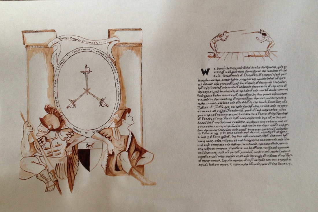
On May 2, the first three Masters of Defense were elevated. I was chosen to do Donovan Shinnock's scroll. Donovan is a friend that I have known for years, and I know of his deep interest in Fabris.
Research information:
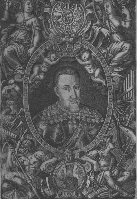
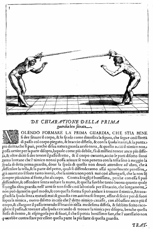
If you are interested in Rapier Research, you will find his research on his blog here. So the choice of artwork was very straightforward - I had to do something from the Fabris manual. So scanning Donovan's blog and looking up ARMA, the Association for Renaissance Martial Arts, I was able to combine elements from the cover page of Salvatore Fabris' manual, plus the plate from page 3 to make a quite nice two page on one sheet scroll that resembled the pages of a manual in tribute to Master Donovan.
Outsourcing the wording
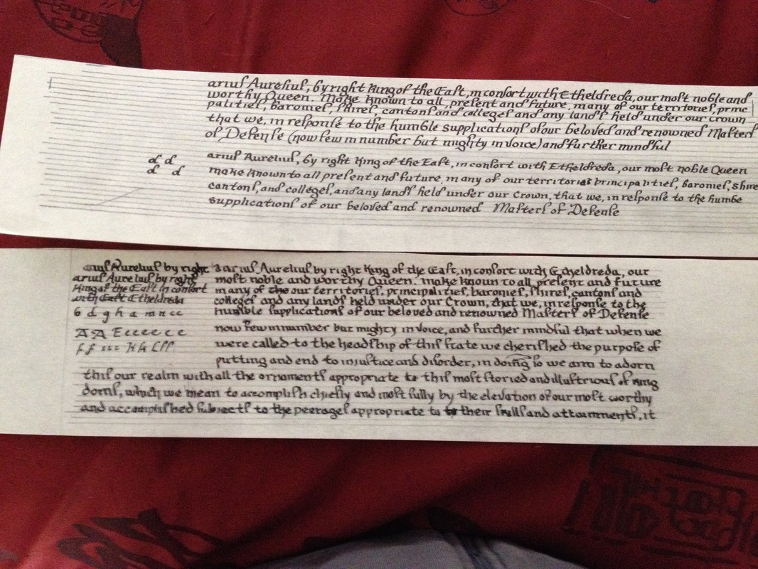
I contacted Alys (or she contacted me) and Alys quickly came up with the wording for the award. Here, you will find the blog by the Extraordinary Alys Mackyntoich, with the words for Donovan's scroll. As you can see, she has such a depth of knowledge that she could write the wording based on her medieval mindset.
The process
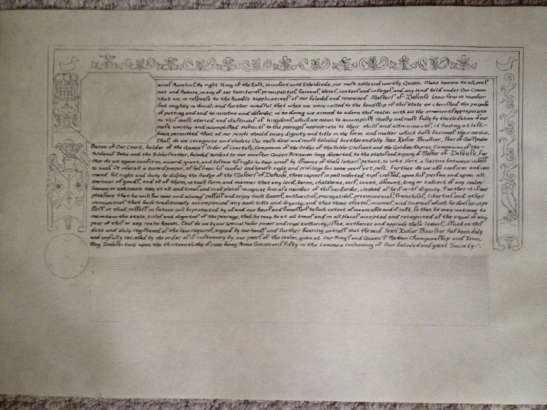
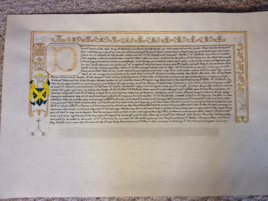
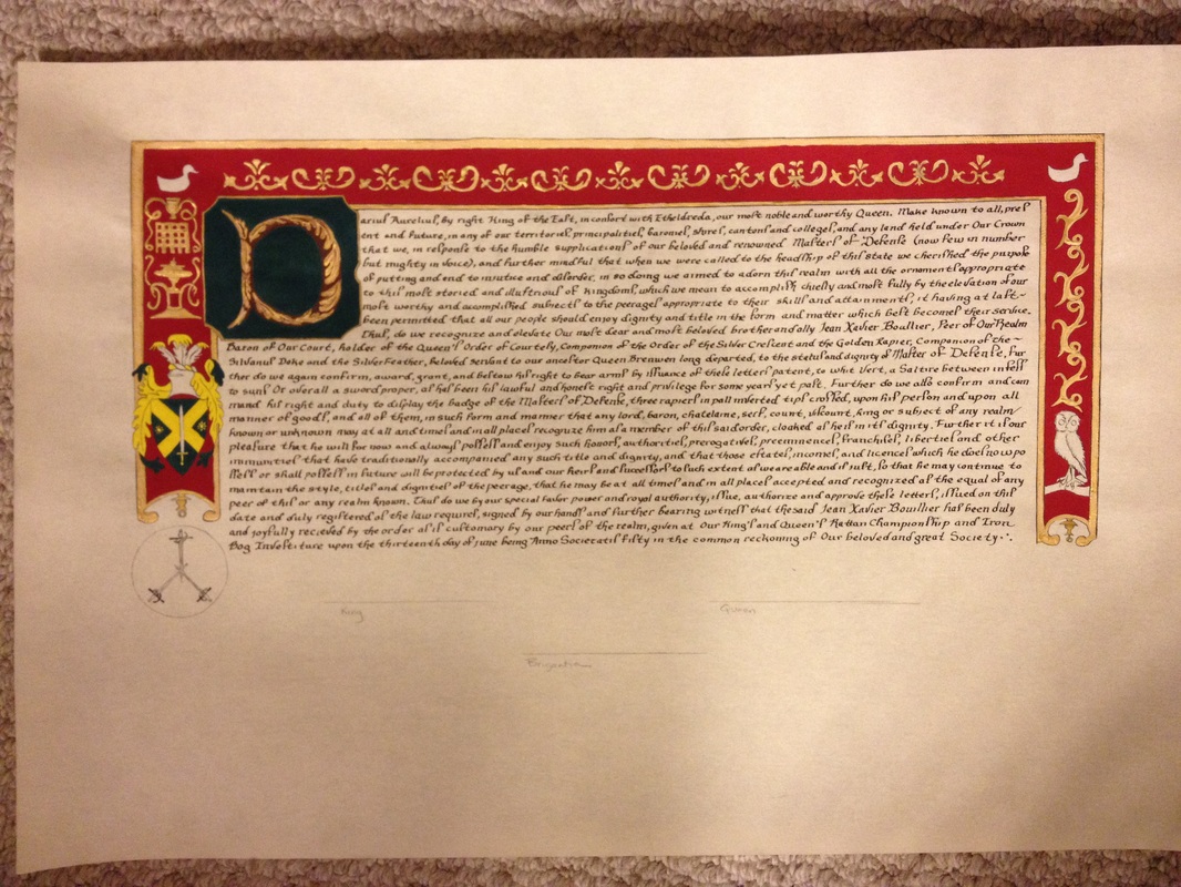
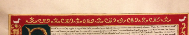
We will start with the final and only picture that I have of this Scroll because unfortunately process pictures were not in the cards this time.
Did I say that I had approximately 3 weeks to do this assignment? Not because I didn't know about it, but because at the time, I did not know who the recipient would be. I have found as an artist that to WHOM the award is going to very much affects what I chose as art and the entire process. I didn't find out about the recipient until April 11.
Did I say something about the flu? Um, yeah, April 19 to the 25th was pretty much spent horizontal because of the flu. I was doing this piece of art an hour at the time, getting up from bed, writing a couple of lines, going back to bed. This was happening at the same time that Donovan's former cadet, Anastasiia was sick and making an embroidered glove for Donovan. But I pushed through.
But that means not many process photos. Therefore, the finished product.
I contacted Alys (or she contacted me) and Alys quickly came up with the wording for the award. Here, you will find the blog by the Extraordinary Alys Mackyntoich, with the words for Donovan's scroll. As you can see, she has such a depth of knowledge that she could write the wording based on her medieval mindset.
The process
We will start with the final and only picture that I have of this Scroll because unfortunately process pictures were not in the cards this time.
Did I say that I had approximately 3 weeks to do this assignment? Not because I didn't know about it, but because at the time, I did not know who the recipient would be. I have found as an artist that to WHOM the award is going to very much affects what I chose as art and the entire process. I didn't find out about the recipient until April 11.
Did I say something about the flu? Um, yeah, April 19 to the 25th was pretty much spent horizontal because of the flu. I was doing this piece of art an hour at the time, getting up from bed, writing a couple of lines, going back to bed. This was happening at the same time that Donovan's former cadet, Anastasiia was sick and making an embroidered glove for Donovan. But I pushed through.
But that means not many process photos. Therefore, the finished product.
Process in words.
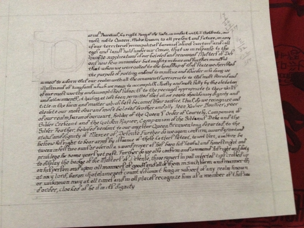
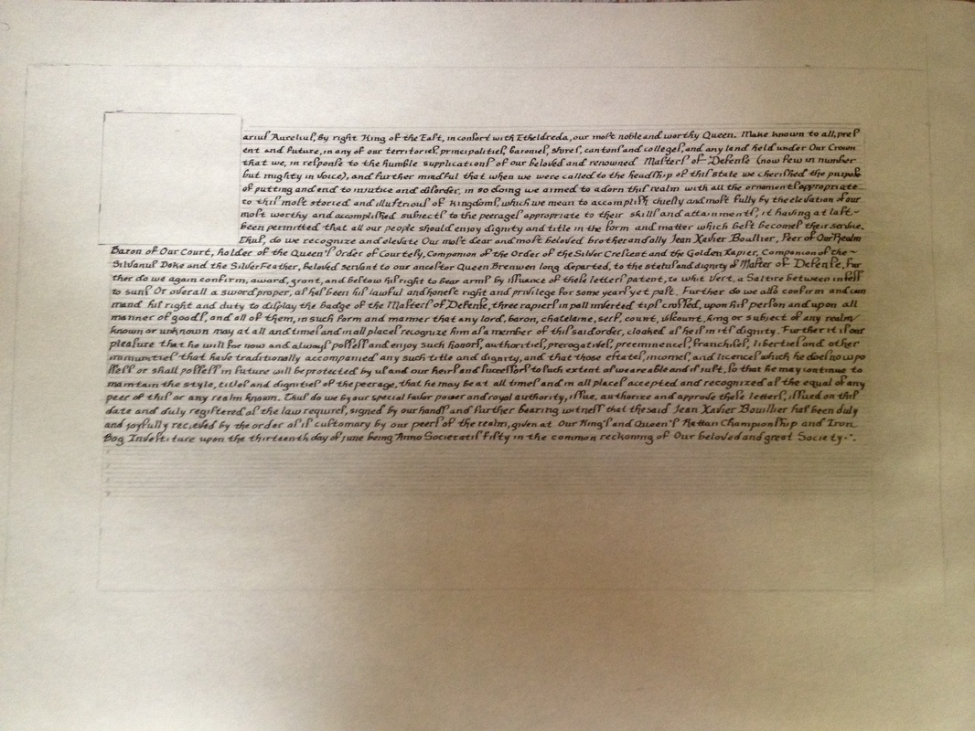
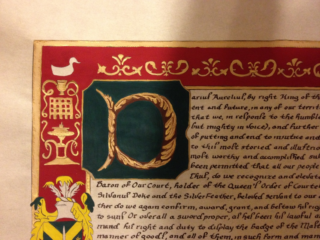
First layout with two pages on once piece of paper. The main face page I penciled in, and then I penciled in the fencing plate above where I would place the words. As usual, words were inked in first, then I moved over to the actual illustration/painting.
I wanted to experiment with a wash rather than go straight for a pen and ink replica of wood block printing that I have done previously. I liked how it came out, but I struggled with the wash. Too much and it was.............a wash. The technique I used was Windsor Newton burnt umber diluted in three different pots to three different consistencies so that I could get the light wash, a dark wash, and then the actual paint to do detail work. I started with a wash, then came in with the darker highlights, going back and forth for the three pots as needed.
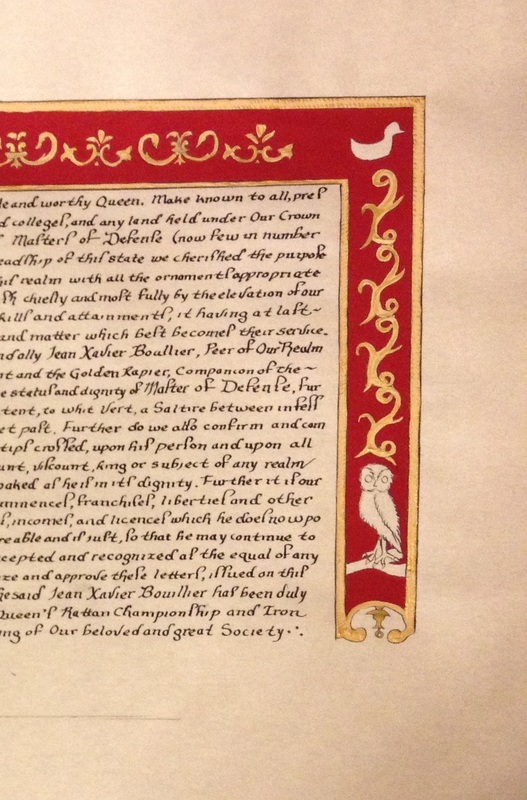
Once the left side was painted, I returned to the right side and filled in the figures from Plate 1 of Fabris. Far less in the way of wash as these were teeny, tiny figures and I didn't want them to get lost.
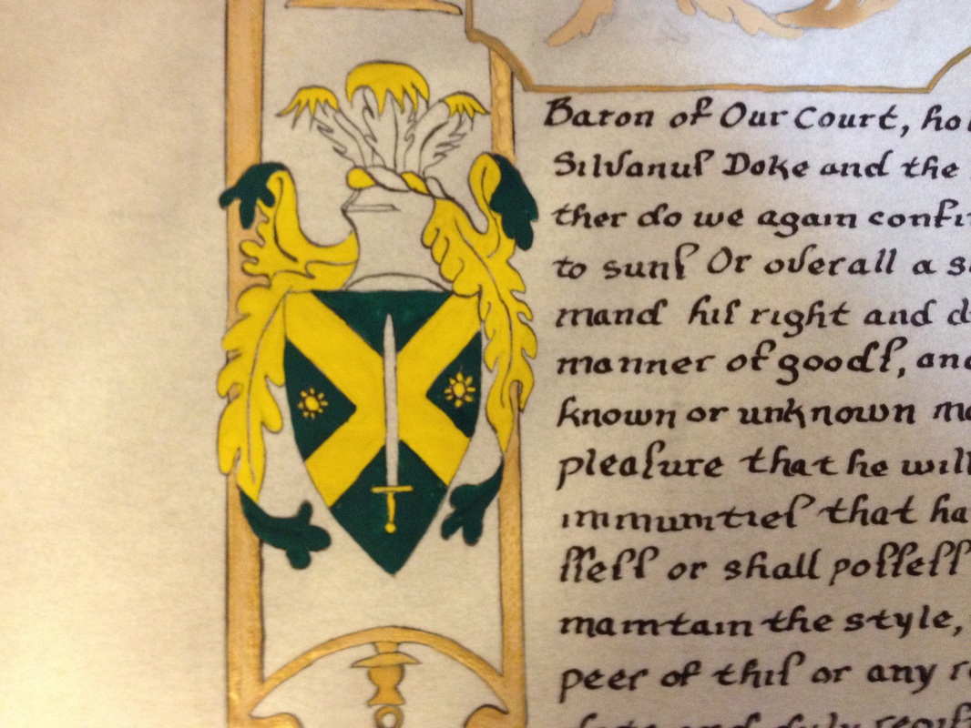
The importance of symbolism:
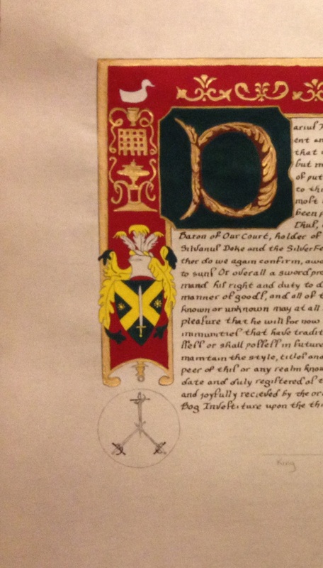
I took certain elements from the cover of the Fabris manual for their symbolism, which I believe Donovan appreciated. I included Mars, the god of War, who is also seen as a guardian and a keeper of peace, and a nod to the idea of a mature, aged combatant with spear (!) in hand, ready to fight. I included Mercury, the god of commerce, poetry, messages and communication (heraldry - I thought Donovan would like that also, as this is another thing in the SCA that he does) as a counterbalance to Mars, as the youthful fencer, resting and waiting for that next bout.
The new symbol for the Order of Defense took a central place with Donovan's arms right below it, flanked by the two gods, making three symbols next to each other, and there were three initial Masters of Defense, there ya go. Like I said, symbolism. Lots of symbolism, which is totally appropriate for a piece of artwork in the medieval and renaissance time period.
Around the badge for the new Order, since this was a new order, I felt it was important to include words that befitted the Order.
First layout with two pages on once piece of paper. The main face page I penciled in, and then I penciled in the fencing plate above where I would place the words. As usual, words were inked in first, then I moved over to the actual illustration/painting.
I wanted to experiment with a wash rather than go straight for a pen and ink replica of wood block printing that I have done previously. I liked how it came out, but I struggled with the wash. Too much and it was.............a wash. The technique I used was Windsor Newton burnt umber diluted in three different pots to three different consistencies so that I could get the light wash, a dark wash, and then the actual paint to do detail work. I started with a wash, then came in with the darker highlights, going back and forth for the three pots as needed.
Once the left side was painted, I returned to the right side and filled in the figures from Plate 1 of Fabris. Far less in the way of wash as these were teeny, tiny figures and I didn't want them to get lost.
The importance of symbolism:
I took certain elements from the cover of the Fabris manual for their symbolism, which I believe Donovan appreciated. I included Mars, the god of War, who is also seen as a guardian and a keeper of peace, and a nod to the idea of a mature, aged combatant with spear (!) in hand, ready to fight. I included Mercury, the god of commerce, poetry, messages and communication (heraldry - I thought Donovan would like that also, as this is another thing in the SCA that he does) as a counterbalance to Mars, as the youthful fencer, resting and waiting for that next bout.
The new symbol for the Order of Defense took a central place with Donovan's arms right below it, flanked by the two gods, making three symbols next to each other, and there were three initial Masters of Defense, there ya go. Like I said, symbolism. Lots of symbolism, which is totally appropriate for a piece of artwork in the medieval and renaissance time period.
Around the badge for the new Order, since this was a new order, I felt it was important to include words that befitted the Order.
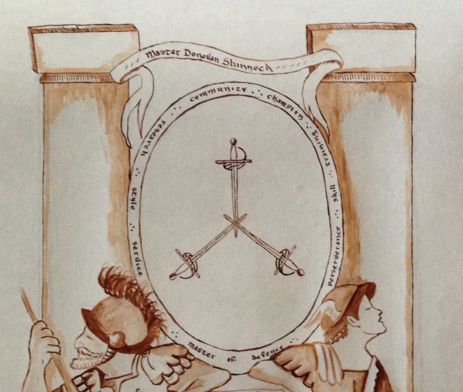
I included community, champion, training, skill, perseverance, service, style and research. That is what the Order of Defense means to me, and to many fencers. Along with the new title of Master of Defense, and then a miniature scroll with Donovan's name and his new title declared to the world.
Things I would have done differently? I would not have had the flu. :-) I would also, if I had more time, experimented with even more detail, but I actually like the fact that this is so clean and uncomplicated in its presentation. I like the way that it really did look like the pages of a manual, and the recipient has told me several times how much he loves it, which is really the point for me.
Thus ends the story of this scroll.

 RSS Feed
