Second Master of Defense scroll. A little bit better timing, from May 6, to June 13. Five weeks. Who's a super artist? That's right, go get 'em.
Again, I have known Jean Xavier for years. The information was green and gold were his colors, that he loves owls. Since he was the former baron of An Dubhaigeainn, the appearance of white ducks, the symbol of that Barony would not be out of line. I obtained a copy of his arms, and started researching.
Research information:
I was looking for something French or English and was pouring through a book a friend gave to me, "Illuminating the Renaissance, the Triumph of Flemish Manuscript Painting in Europe", Kren and McKendrick, The J.Paul Getty Museum, Los Angeles, 2003. The exemplars were lovely and gave me some great ideas, but the one on page 438 caught my eye.
Plus I looked at a lot of French and English exemplars from the period and borrowed from quite a few. The Henry VIII to Thomas Forster has some very poor exemplars online, and the one that I used was from the book "Illuminating the Renaissance, the Triumph of Flemish Manuscript Painting in Europe", Kren and McKendrick, The J.Paul Getty Museum, Los Angeles, 2003, page 438. You can download it here and I highly recommend it for sources. The specific piece was : Letters Patent of Henry VIII to Thomas Forster. England, between April 28, 1524 and February 8, 1528. The google books give the reference here:
Outsourcing the wording
I asked Anastasiia Gutane if she would be willing to write the words for this scroll. She had been told that I did not care if it was long, that I was a scribe that wasn't afraid of long scroll texts. Okay, then. I was delivered of 633 words. Six hundred and thirty three Beautiful words. Words are online here. When I received the wording, I spent a day practicing the hand at a Camelot Spring get together. They did not fit on the paper. There would be no room at all for any illumination. No seriously, not a bit. I didn't want to cut it, it was lovely. The reference material is :
http://www.heraldica.org/topics/france/noblesse.htm
http://www.heraldica.org/topics/france/peerage.htm
http://corpus.enc.sorbonne.fr/actesroyauxdupoitou/tome12/1733
And I'm sure that Anastasiia's journal goes into more detail.
After the first run, in the slightly immortal words of Martin Brody in Jaws, "We're going to need a bigger piece of paper."
Larger paper is acquired and I begin the process of writing the words again. This took several test sheets. I think some people benefit from looking at what doesn't make the final cut, so here you go.
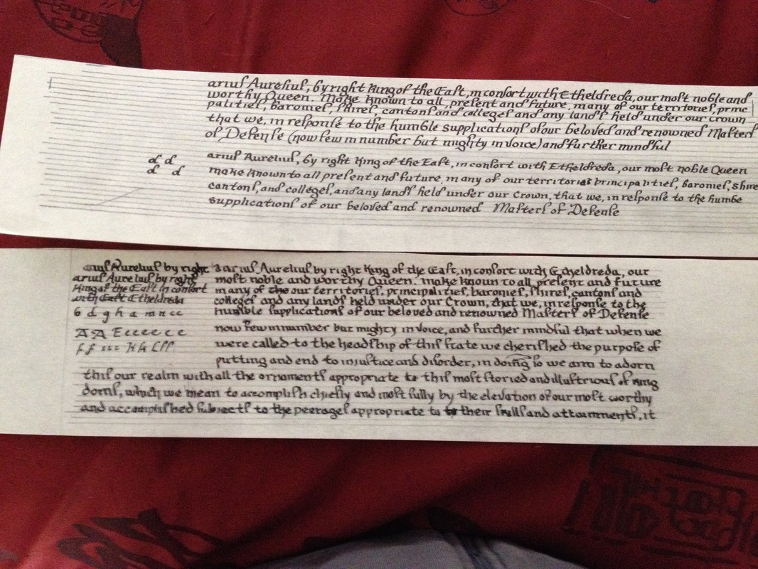 |  |
Above left is learning the alphabet of the English chancery hand that the original had which took some doing, as it seemed the curves all went in the opposite way than I am used to. The photograph on the right is the first run through on what became the too small piece of paper. As you can see, I just stopped writing because it was clear it wasn't going to fit. The writing changed somewhat as I was going also, as I began to get comfortable with the particulars of that hand.
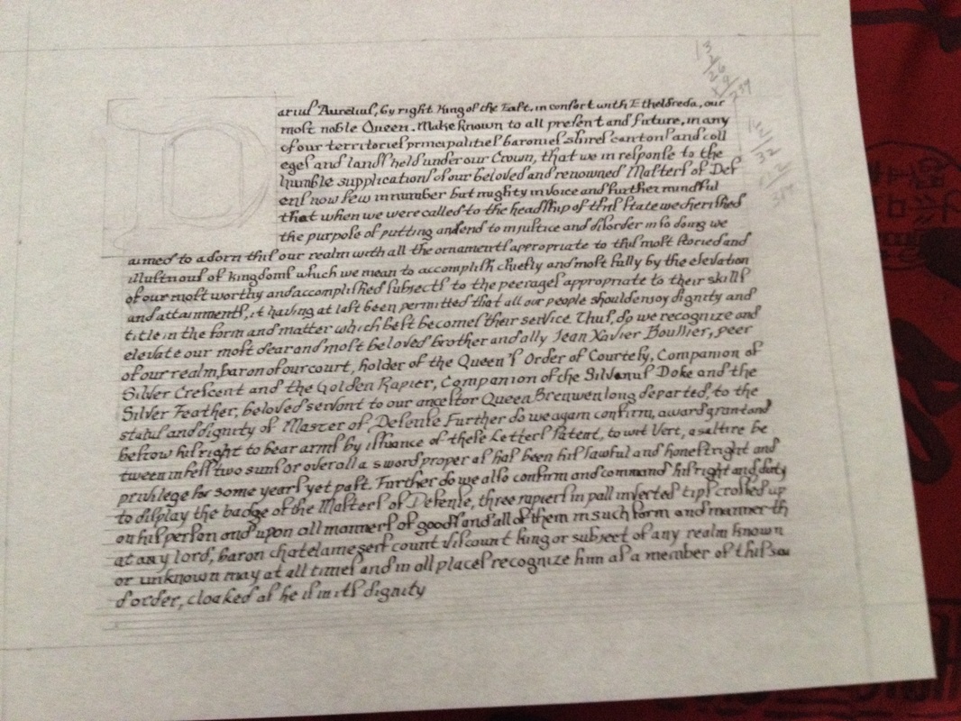
Basic layout of where I wanted things to lie, so that I could write in the words. I cut this sheet from a larger sheet and I used the final dimensions of the original piece of 13 x 24 inches. I don't think that this picture really reflects that well. Once done with the writing, on to filling in the rest of the design with pencil.
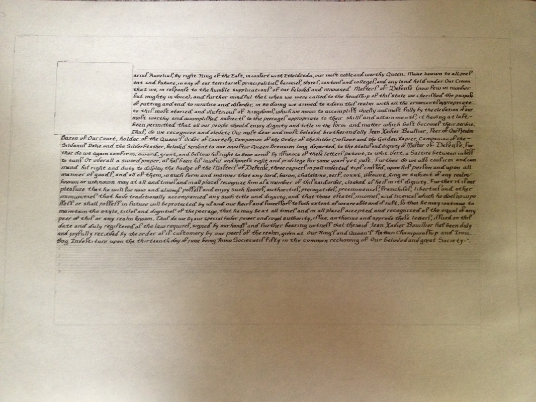
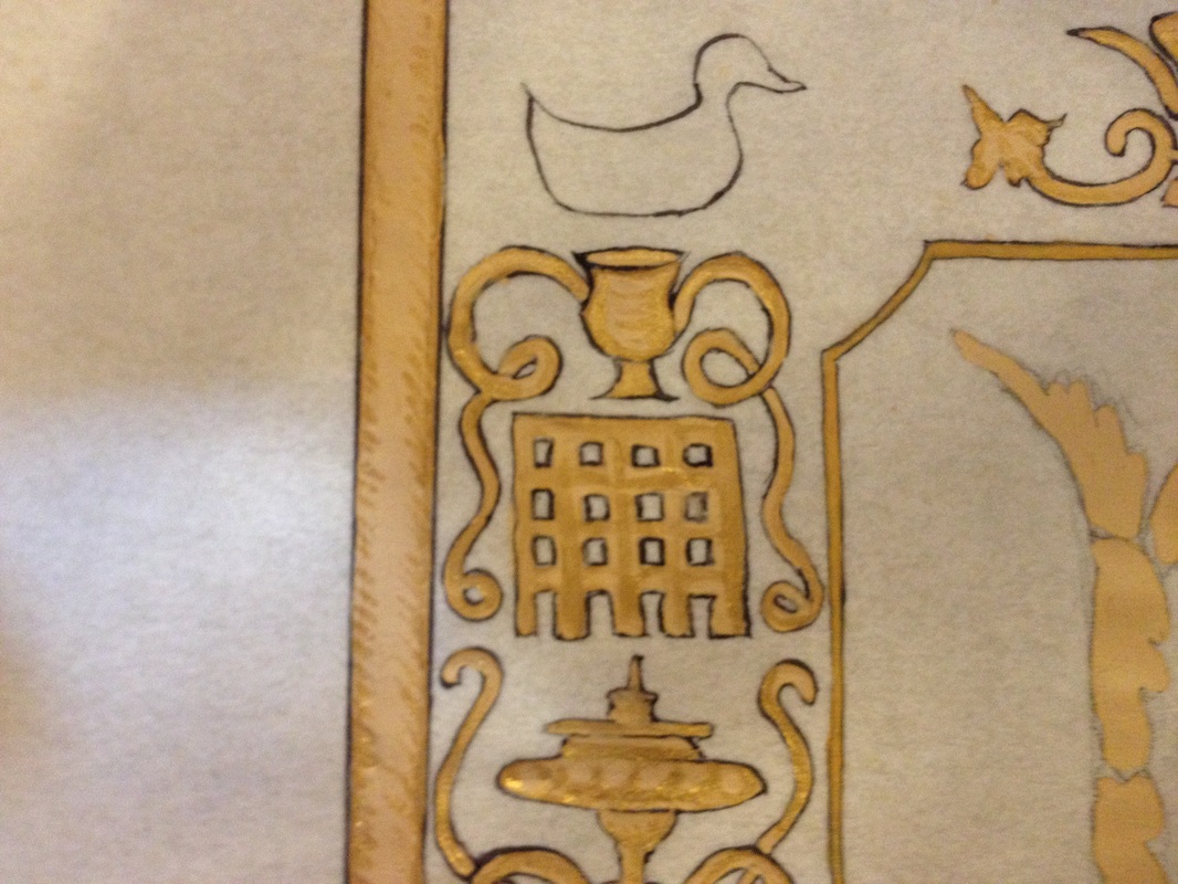
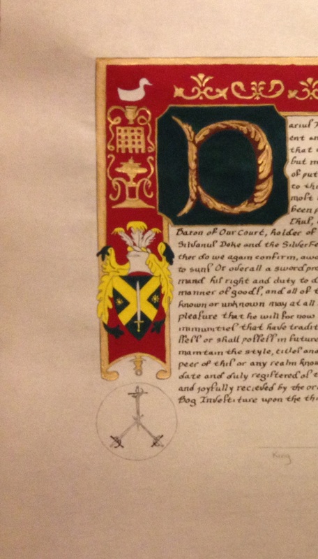
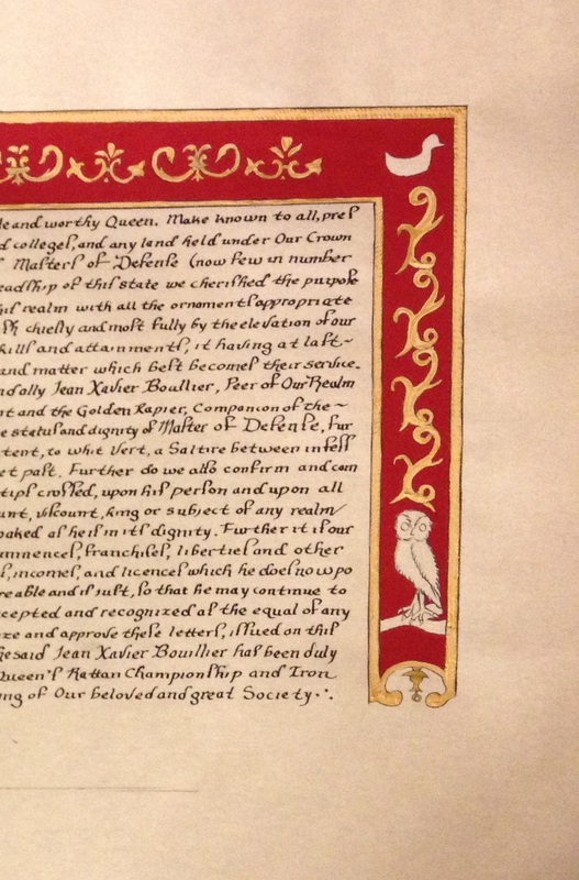
Penciled in, and then inked in. The inking was giving me quite the trouble in the upper right hand corner, and I ended up cleaning that up with paint, and a little bit of scraping with an exacto knife. I used some of the elements from the original piece, and then dropped in the badge for the Order of Defense on the left, with the achievement of Jean Xavier's arms above it, two ducks in the upper corners right and left, and an owl on the bottom right to balance out the composition.
Things are getting busy, and so much work, and not as many pictures.
So I'm sitting on the floor, grinding paint and my sweetie comes in and says, "What are you doing?" I say, "I'm making paint." Response, "Oh, huh." I decided to try some yellow ochre from pigment as a stretch. I will not tell you it was easy. I mixed it happily enough but the first time I put it on, I had to scrape nearly all of it off as it dried weird. All the paint for this particular project was drying weird, and I ended up with spots that had to be scraped off and reapplied. I suspect it was due to the humidity, but it could be because of the paper, or I could have mixed the paint wrong.
My plan is to experiment with the paint when I don't have a deadline looming. I know that this may be a pipe dream, but one can try to dream.
I also worked with Mistress Eleanor to try and figure out the shiny quality of the paint as it was definitely not gold leaf, but had that shimmer. More research pointed to shell gold, so I borrowed some from Eleanor to try out and that seemed to do the trick. I then had Lady Doselena from Guild Mirandola quick send me shell gold. I will tell you that shell gold is rather pricey, but was well worth the effect. I used a pen and ink type stroke that is used in period painting and it punched up the yellow ochre. Score!
The paint for the achievement was holbein's green and holbein's yellow, which work very well. A little bit of white added to both and I had working colors. I would use the green again later.
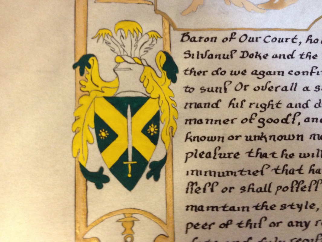
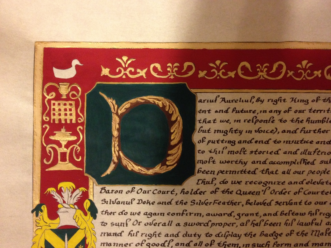
Close up of the achievement. The square surrounding the Initial letter is with mosaic gold, and old standby for me. You can see the shimmer from the shell gold on the rectangular pieces.
A better closeup of the yellow ochre with the shell gold painted with the period technique.
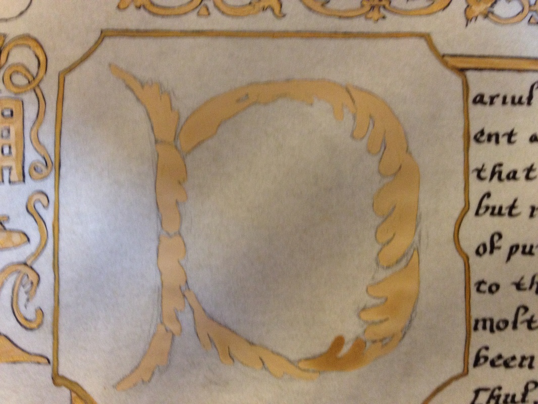
The initial letter. As you can see, the lower leaf is not quite dry, so that shows you the change in color from wet yellow ochre to dry yellow ochre which are the other leaves.

Close up of the initial letter D. I surrounded the letter with burnt umber to punch it up, and the leaves that had the yellow ochre on them received a layer of shell gold and then burnt umber (make that two different pots of burnt umber, one with a little bit of white, then the second one with a VERY little bit of white) for the detail work. I finished with green background which echoed the green from the achievement. I think I would like to practice the painting of leaves more so that there is more detail in future ones.
As you can also see in the meantime, I painted in the red (Holbein's cadmium red purple, again slightly dulled with a very little white, I highly recommend this color) for the background. It really punched the yellow ochre and gold up.
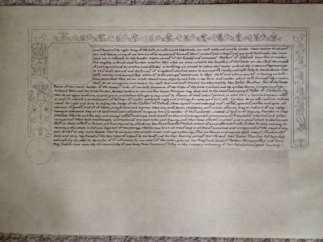
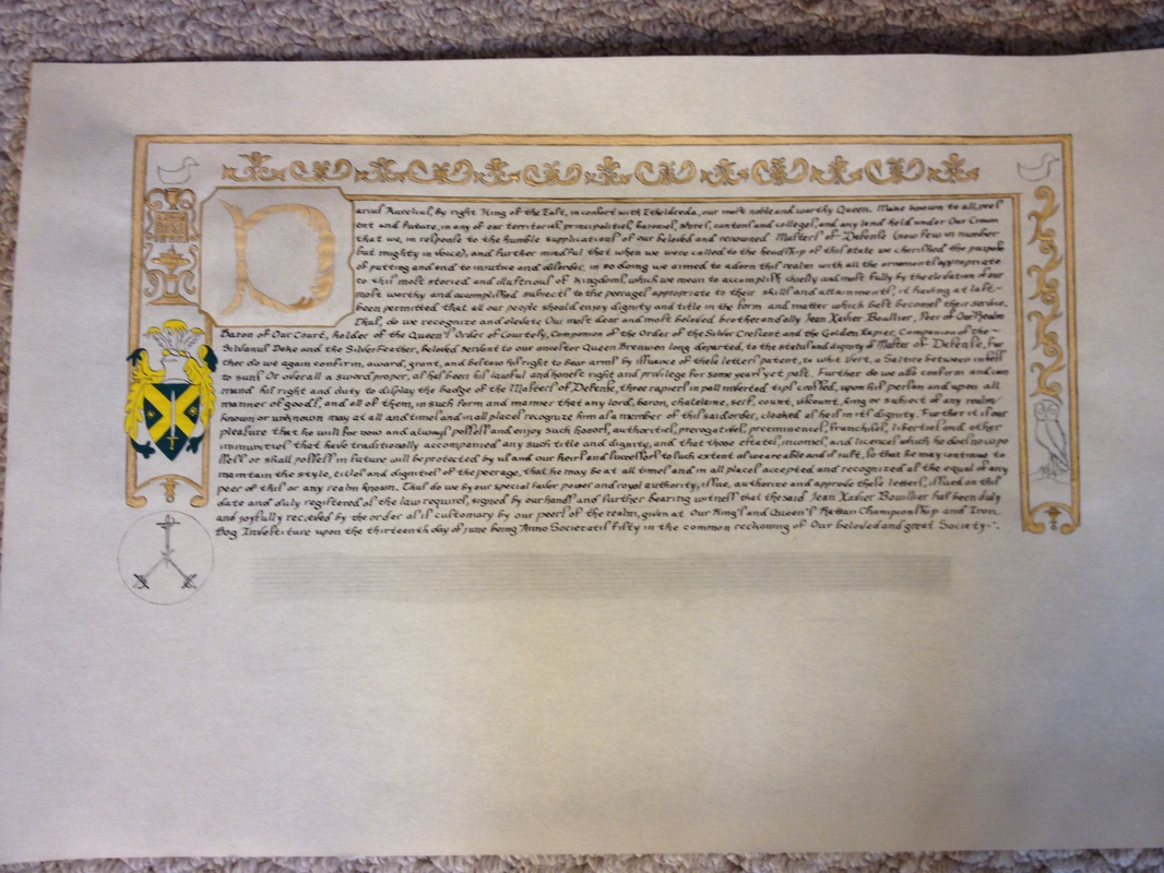
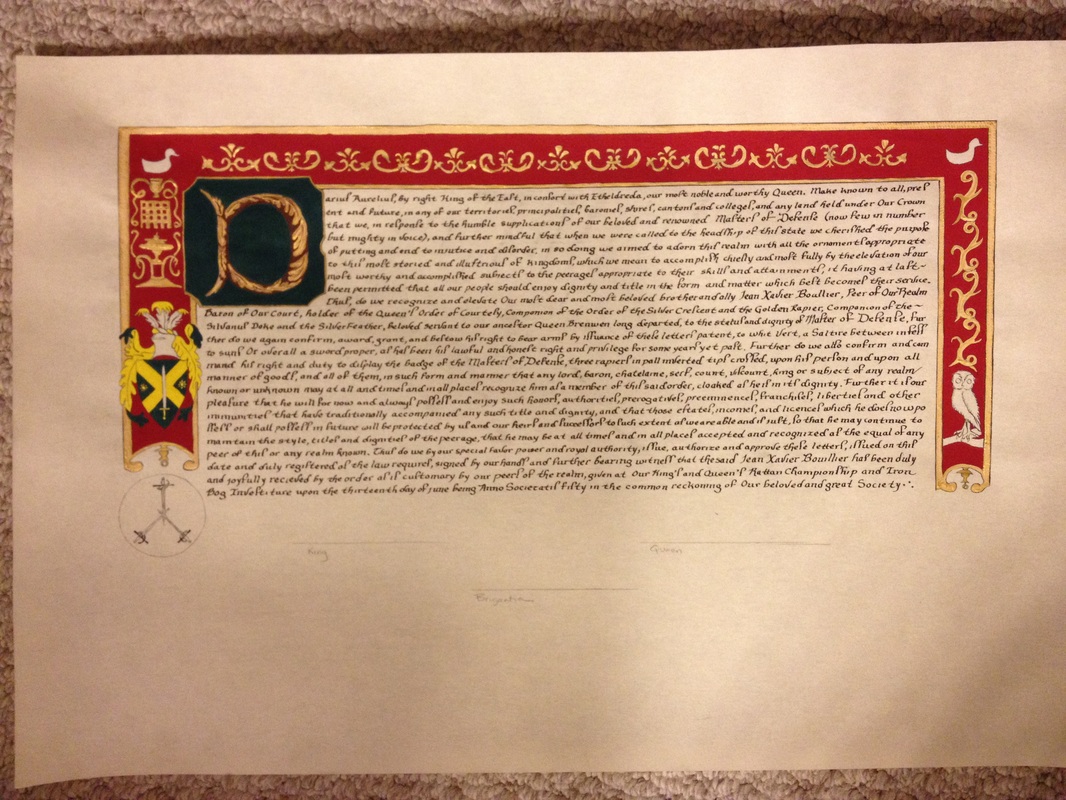
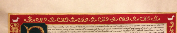
Below is the finished product.
As you can also see in the meantime, I painted in the red (Holbein's cadmium red purple, again slightly dulled with a very little white, I highly recommend this color) for the background. It really punched the yellow ochre and gold up.
Below is the finished product.
 |  |  |
Detail pictures above.
 RSS Feed
