There be Sharks
Set up
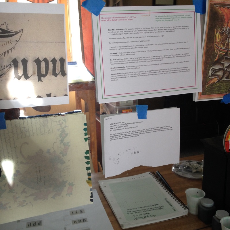
I find it, easiest for myself, if I post the assignment in its parts in front of my work station on the mirror - the inspiration, my practice sheets, any information that is necessary for the project. The inspirations are to the left and right slightly off of camera, but will be included below. The sheet on the bottom left is my color testing sheet and paint sheet, and as you can see, it is usually a recycled piece from some other project that did not make the cut. I am very Yankee in that I don't believe in any waste and from my research of artists of the time period that I am interested in, the artists did the same thing. So I reuse my paper as much as possible as test sheets. Reflected in the mirror is the practice sheets for calligraphy.
As you might be able to see the set of instructions in the middle are far more detailed than I am usually dealing with in a scroll assignment. The size of the illumination was very specific, the paper needed to be 11" x 8.5" and the illumination would be 10" x 7.5". There were also restrictions on metallic leaf and inks (they don't photograph or scan well, and certain pigments don't reproduce well with four color printing. Ultramarine, one of my standbys for my blues would present a challenge. Also certain yellows and oranges were difficult and would scan brown. That meant that I needed to do more test sheets with a different palette than I might have normally chosen.
As you might be able to see the set of instructions in the middle are far more detailed than I am usually dealing with in a scroll assignment. The size of the illumination was very specific, the paper needed to be 11" x 8.5" and the illumination would be 10" x 7.5". There were also restrictions on metallic leaf and inks (they don't photograph or scan well, and certain pigments don't reproduce well with four color printing. Ultramarine, one of my standbys for my blues would present a challenge. Also certain yellows and oranges were difficult and would scan brown. That meant that I needed to do more test sheets with a different palette than I might have normally chosen.
Below is one example of the many test sheets that I used for this project. I am experimenting with the colors that I wish to use on the project on the same type of paper that I wish to use. I want to see how the shading will look, get the right colors and if any adjustments have to be made, I need to do it before the final piece.
Research
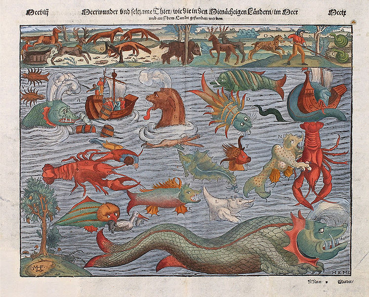
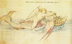
I did quite a bit of research for this subject to come up with a historical shark that would fit the parameters of the assignment. It also was interesting finding out the different mythical and not so mythical beasts that dwelled in the sea as seen by medieval eyes. The assignment was initiated in June of 2015 and would be due September 1. I received the wording written by my good friend, Alexandre Lerot d'Avigne, current Prince of Insulae Draconis which is below:
"The shark is the laziest of fish, but is fierce when roused. When hunting, it swims in a circle which it draws tight around its prey. If its victim remains still, the shark will often lose interest and swim on. It is the foe of the lava otter, for they are too much alike to live in peace. It is found throughout the world, but schools most heavily along the eastern shores."
I ended up really enjoying the research and it gave me a better idea of what I wanted it to look like overall and what the medieval person was thinking of when they thought of Shark/Whale/Sea Monster.
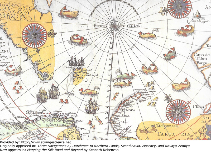
I give you the research. Many were found on www.strangescience.com under its gallery on sea monsters.
"The shark is the laziest of fish, but is fierce when roused. When hunting, it swims in a circle which it draws tight around its prey. If its victim remains still, the shark will often lose interest and swim on. It is the foe of the lava otter, for they are too much alike to live in peace. It is found throughout the world, but schools most heavily along the eastern shores."
I ended up really enjoying the research and it gave me a better idea of what I wanted it to look like overall and what the medieval person was thinking of when they thought of Shark/Whale/Sea Monster.
I give you the research. Many were found on www.strangescience.com under its gallery on sea monsters.
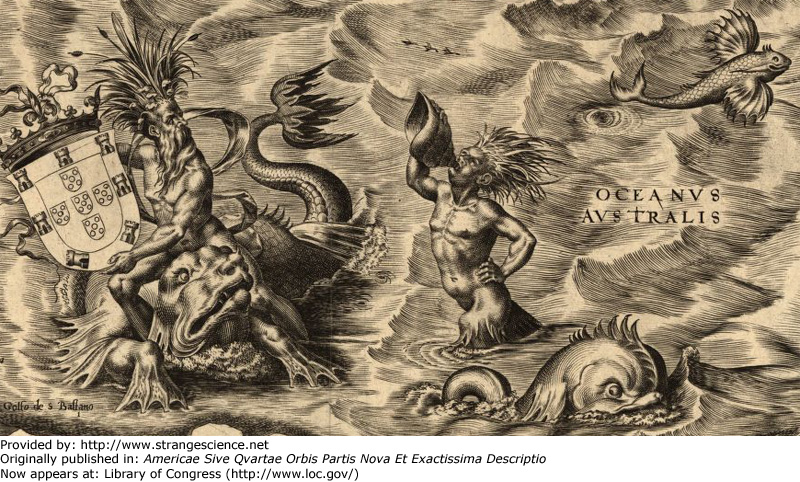
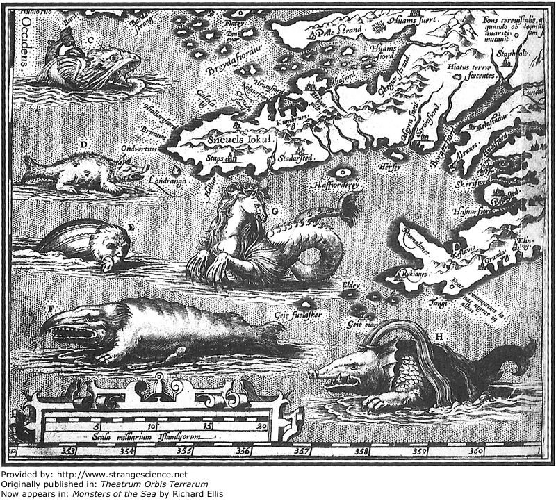
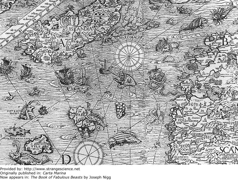
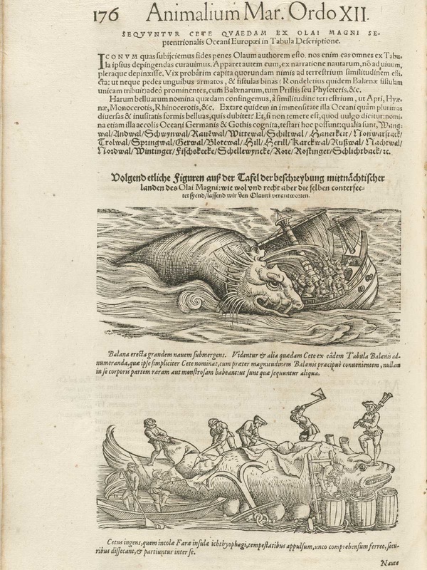
taken from the vignettes on Olaus Magnus's Carta marina
1514, by Albrecht Durer
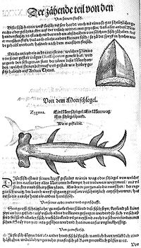
1575, Conrad Gesner, Historia Animalium
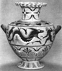
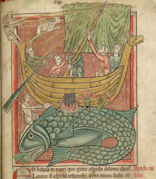
Year: 520 - 510 BC, A Ketos in Early Athens: An Archaeology of Whales and Sea Monsters in the Greek World" by Papadopoulos and Ruscillo in American Journal of Archaeology and "Monk Seals in Antiquity" by Johnson and Lavigne in Mededelingen No. 35
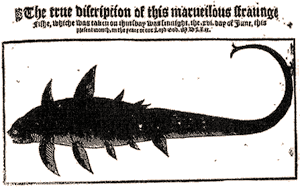
1569, The True Discripcion of this Marueilous Straunge Fishe
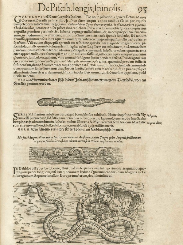
1575, Conrad Gesner, Historia Animalium
1575, Conrad Gesner, Historia Animalium
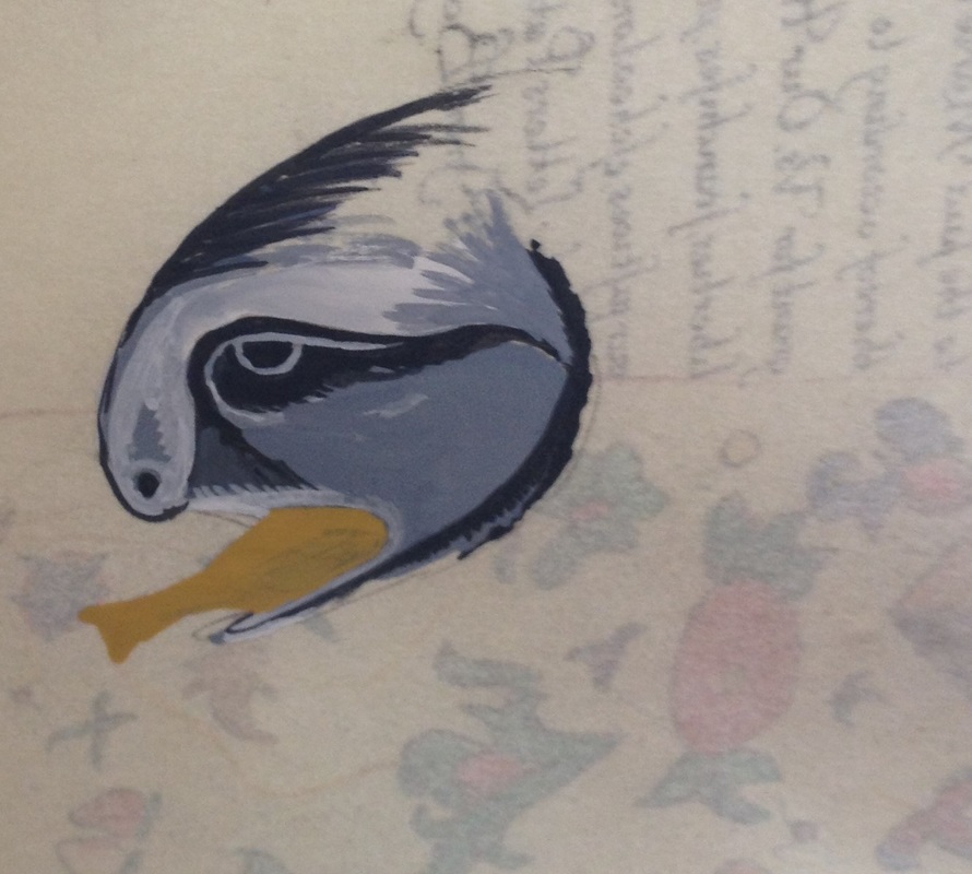
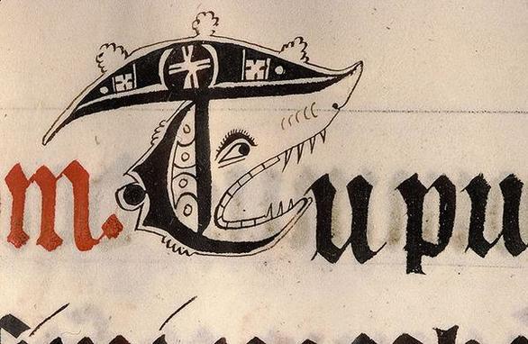
Try as I might, I was unable to find the original manuscript for the above Shark with little hat! I found it on http://www.medievalists.net/2015/02/09/week-medieval-manuscript-images-19/ which showed several images that had been tweeted. If anyone has some clues to the original, I would be eternally grateful.
British Library, Harley MS 4751, Folio 69r
Palette
I chose the last two for the project because I liked the colors and the Shark eating its prey and it delighted me that there was a reference for a Shark doodle, almost marginalia that I could include in the paragraph about the shark.
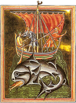
Century: 13th, MS. Ashmole 151, folio 086v, 81, 9, housed in Bodleian Library
Painting
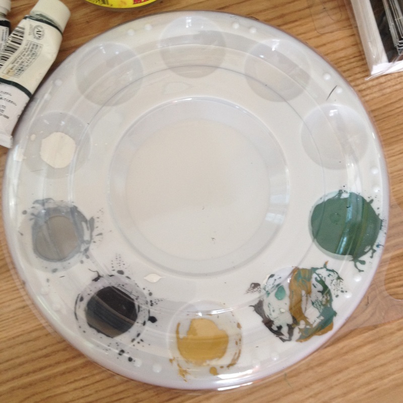
Above: Much less colorful paint palette. We had specific instructions that gold/silver and ultramarine do not photograph well, I had to avoid my usual standbys. The lovely grey of the shark gave me a different color palette to work from.
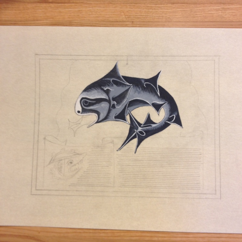
I made several test layouts for this one before I settled on the above layout. Words with illuminated Capital T, with room for words by Alexandre Lerot d'Avigne and calligraphy by Eleanor Catlyng. I used Windsor Newton Payne's Grey with a 00 and a 1 brush. I made a gradation of the grey with a dark grey, light grey, lighter grey and then a pot of permanent white.
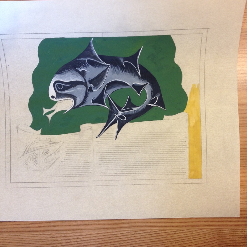
Once done with the shark proper, on to the lovely green sea that is depicted in the original. Holbein green, mixed with black, white and yellow ochre gave me the right look that color matched the original. Holbein yellow ochre was the surrounding ground, as I could not use mosaic gold or leaf gold for this project.
Filling up the background, touch ups.
Finished Product
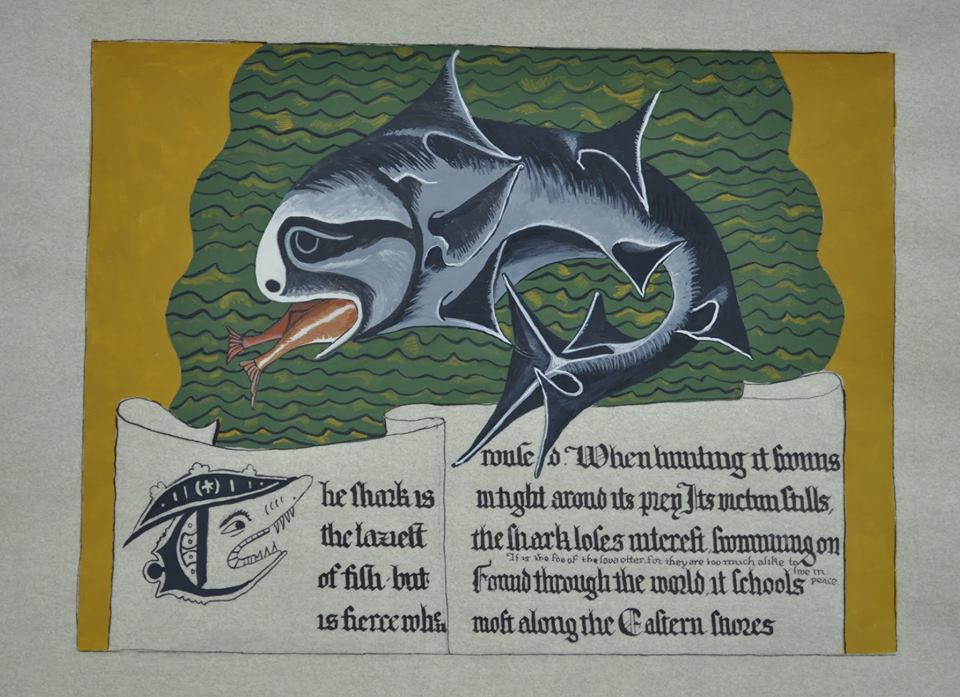
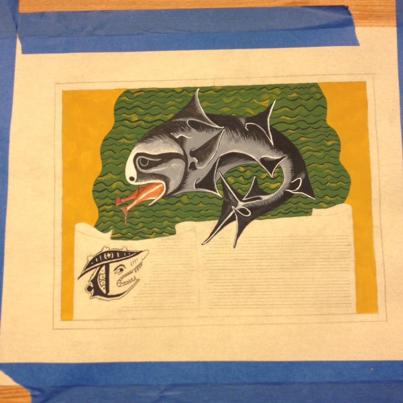
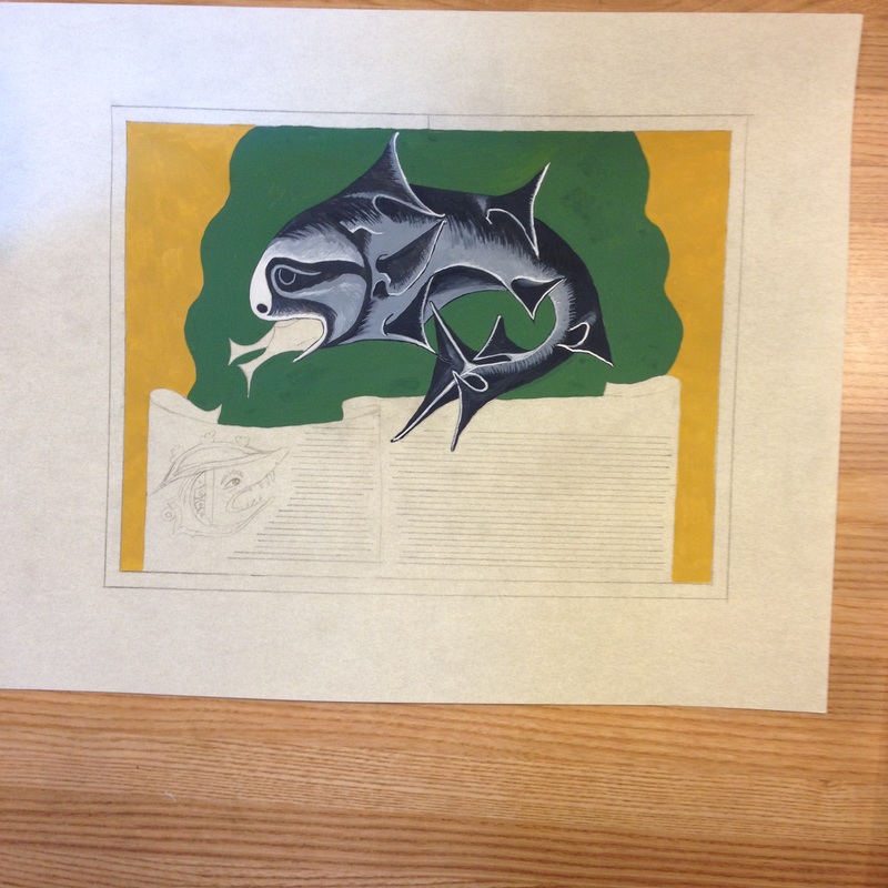
I used lamp black for the waves of the sea, and yellow ochre (again, I could not use gold) to highlight the sea. Then I painted (not inked!) the shark face upon the Capital T complete with jaunty hat.
At this point, it was handed off to Eleanor to work her magic on the calligraphy.
At this point, it was handed off to Eleanor to work her magic on the calligraphy.
 RSS Feed
