RESEARCH
I know this extremely gentle, talented, man, however, I wanted more information on him and his persona in order to fill things out a bit. So I checked into the East Kingdom Wiki, no entry. I checked FB, yup, there, a few pictures. I pulled those to give me some inspiration. The pictures I have seen of Guthfrith is with a hat, so I am looking for his style of clothes and a fashionable hat. One of the things that I have pointed out for portraits is that there is sometimes one thing that will read X person. In this case, a particular style of hat will identify Guthfrith. I then did a general Google search on Guthfrith, and finally came up with some background on the Barony of Ruantallan's page, where Guthfrith and Isobel are Baron and Baronness. www.ruantallan.eastkingdom.org/our-baron-and-baroness/
"Our personas are firmly rooted in late fifteenth century England these days (despite the C10th Danish name Guthfrith…hmmm). Guthfrith has a wide range of interests including heavy, rapier and siege combat, archery, woodworking, metalworking and miscellaneous A&S. Isobel’s main passion is C15th costuming, but any A&S and particularly anything that creates more C15th ambience is fun (Isobel also looks forward to acquiring a longbow and learning to shoot things more accurately). Occasionally you may see us disguised as sixth century Anglo-Saxons." from their Baronial page.
Since this is for a Golden Rapier award, I first looked into rapier manuals. The Arma is one of the best resources for fechtbuch's.
www.thearma.org/manuals.htm#.V2BWBzXiONd
I was looking for English, maybe Danish, but just getting some ideas.
I started with Talhoffer's Fechtbuch, which is a German Manuscript, and has three different editions, one dated 1443, one dated 1459, and one dated 1467.
Edition 1467 had several pictures of rapier fighters with hats.
www.thearma.org/talhoffer/t16.htm
http://www.thearma.org/talhoffer/t24.htm
www.thearma.org/talhoffer/t23.htm
Th 1459 edition one also had some nice pictures, and was subtitled "Fight Earnestly". I found pictures again with hats page 196 through page 200. It is a pdf download, so be aware. There are some nice equestrian pictures in there, so I need to note that for future reference. Some of the pictures are pretty gory, with chopped off hands, chopped off heads, and blood spurting. I won't be using anything from those.
www.thearma.org/pdf/Fight-Earnestly.pdf
There is also I33, one of the earliest known rapier manuals, German on sword and buckler from 1295.
i.imgur.com/OgjnwZP.jpg
And Durer's Fechtbuch from 1520.
http://www.thearma.org/Manuals/Duerer.htm#.V3E4MzXiONf
After reviewing them, I decided to go with Talhoffer, plate 23, but use elements from I33 for shading, painting in a different way than I have done in the past, more watercolor shading, rather than true gouache painting that would happen in illuminated manuscripts.
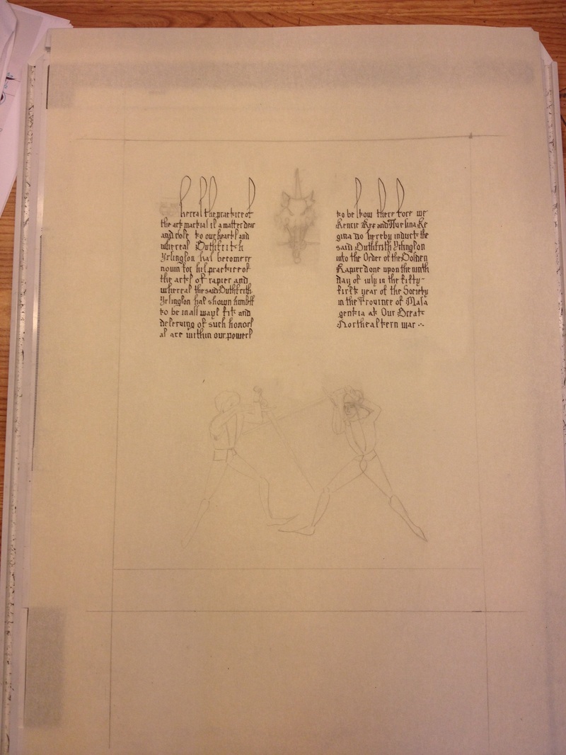
I wrote the wording. My procedure is to type it up on the computer, print out two copies and then practice. I print two copies because I often mark up one with how many characters, how many lines, notations on where I started and stopped. I did a few practice runs and then did the layout for the scroll. I wanted to have the Golden Rapier prominent and center, words at the top and fighters at the bottom.
I know this extremely gentle, talented, man, however, I wanted more information on him and his persona in order to fill things out a bit. So I checked into the East Kingdom Wiki, no entry. I checked FB, yup, there, a few pictures. I pulled those to give me some inspiration. The pictures I have seen of Guthfrith is with a hat, so I am looking for his style of clothes and a fashionable hat. One of the things that I have pointed out for portraits is that there is sometimes one thing that will read X person. In this case, a particular style of hat will identify Guthfrith. I then did a general Google search on Guthfrith, and finally came up with some background on the Barony of Ruantallan's page, where Guthfrith and Isobel are Baron and Baronness. www.ruantallan.eastkingdom.org/our-baron-and-baroness/
"Our personas are firmly rooted in late fifteenth century England these days (despite the C10th Danish name Guthfrith…hmmm). Guthfrith has a wide range of interests including heavy, rapier and siege combat, archery, woodworking, metalworking and miscellaneous A&S. Isobel’s main passion is C15th costuming, but any A&S and particularly anything that creates more C15th ambience is fun (Isobel also looks forward to acquiring a longbow and learning to shoot things more accurately). Occasionally you may see us disguised as sixth century Anglo-Saxons." from their Baronial page.
Since this is for a Golden Rapier award, I first looked into rapier manuals. The Arma is one of the best resources for fechtbuch's.
www.thearma.org/manuals.htm#.V2BWBzXiONd
I was looking for English, maybe Danish, but just getting some ideas.
I started with Talhoffer's Fechtbuch, which is a German Manuscript, and has three different editions, one dated 1443, one dated 1459, and one dated 1467.
Edition 1467 had several pictures of rapier fighters with hats.
www.thearma.org/talhoffer/t16.htm
http://www.thearma.org/talhoffer/t24.htm
www.thearma.org/talhoffer/t23.htm
Th 1459 edition one also had some nice pictures, and was subtitled "Fight Earnestly". I found pictures again with hats page 196 through page 200. It is a pdf download, so be aware. There are some nice equestrian pictures in there, so I need to note that for future reference. Some of the pictures are pretty gory, with chopped off hands, chopped off heads, and blood spurting. I won't be using anything from those.
www.thearma.org/pdf/Fight-Earnestly.pdf
There is also I33, one of the earliest known rapier manuals, German on sword and buckler from 1295.
i.imgur.com/OgjnwZP.jpg
And Durer's Fechtbuch from 1520.
http://www.thearma.org/Manuals/Duerer.htm#.V3E4MzXiONf
After reviewing them, I decided to go with Talhoffer, plate 23, but use elements from I33 for shading, painting in a different way than I have done in the past, more watercolor shading, rather than true gouache painting that would happen in illuminated manuscripts.
I wrote the wording. My procedure is to type it up on the computer, print out two copies and then practice. I print two copies because I often mark up one with how many characters, how many lines, notations on where I started and stopped. I did a few practice runs and then did the layout for the scroll. I wanted to have the Golden Rapier prominent and center, words at the top and fighters at the bottom.
I had wanted to experiment with the lovely, looping ascenders and while they are not perfect, I'm happy with the consistent height. More practice is needed.
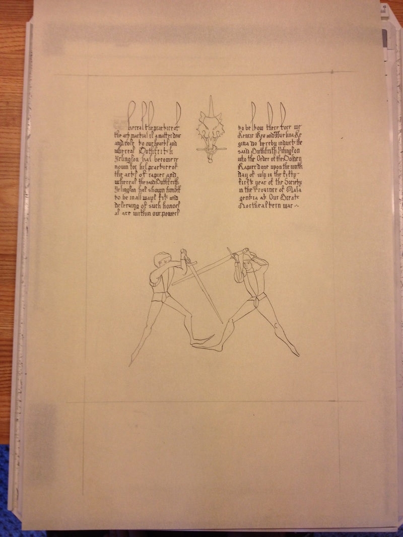
Inking up the Golden Rapier and the figures using a crow quill pen and also Higgins Eternal Ink.
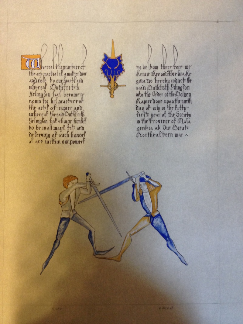
Once I started my painting, I just forgot to stop and take pictures along the way. I'm still working on taking pictures that have appropriate lighting. I have received some hints from camera savvy friends, so hopefully future photos will be clearer. I used mosaic gold for the gold in the Golden Rapier, and lapis lazuli from a batch of period pigments that I had and a lapis lazuli that I had greyed out a little more for the left hand fighter. I also used permanent white, yellow ochre and payne's grey (all Windsor Newton brand) for the rest of the paints. I always like the way that the ultramarine pops. The paper was the opaline vellum that I bought at Pennsic last year. It is closest to vellum without the price and I like how it takes just about anything without buckling. I highly recommend it and will be picking up some more this Pennsic.
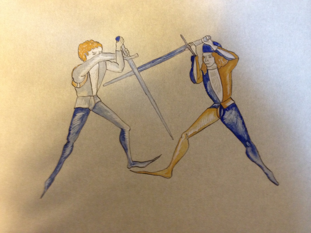
Closeup of figures.
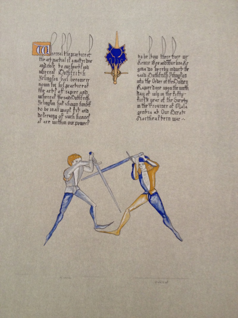
Final scroll.
Reflections:
I liked the way this came out, it is detailed, but you really have to look carefully for the details. My calligraphy is improving, but I still need more practice for better period looking spacing. As I said earlier, I need to improve my photography. :-)
Reflections:
I liked the way this came out, it is detailed, but you really have to look carefully for the details. My calligraphy is improving, but I still need more practice for better period looking spacing. As I said earlier, I need to improve my photography. :-)
 RSS Feed
