`The East Kingdom Calendar project is a fundraiser for the royalty fund. I did it last year, and was asked again to do it this year. The website is here.
The assignment for the 2017 calendar - signs of the horoscopes and I decided that I would love to do Scorpio, my own sign. Many calendars of the period of time that I study (500 AD to 1600 AD) have illuminations of the astrological symbols as well as labors that occurred during that calendar month. I was assigned October, and Scorpio. I was provided with some research that Gundormr provided to assist all the artists on this prjecct, and also did my own digging.
RESEARCH:
The medieval visuals for Scorpio showed me that sometimes the artists really didn't know what a real scorpion looked like, and so the representation was on a spectrum of somewhat like a scorpion, or more like an ugly, black bug or a dragon-like creature with pincers for good measure. Dragons came up frequently. Sometimes a fierce dragon, sometimes a dragon biting its own tail, and sometimes a two headed dragon. I collected a variety of medieval visual representations of Scorpio and started to decide what elements I would like to incorporate in the calendar. The calendar has very particular requirements as to size and includes wording on each month. So step one, the examples.
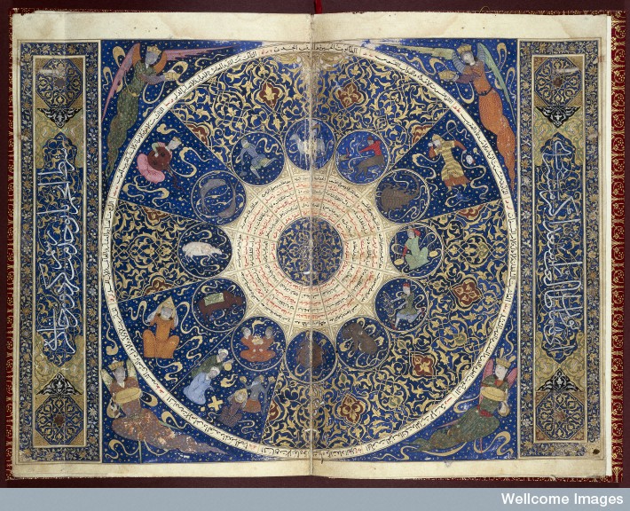
Horoscope of Prince Iskandar, grandson of Tamerlane, the Turkman Mongol conqueror. This horoscope shows the position of the heavens at the moment of Iskandar's birth on 25th April 1384. The scorpion looks like a modern day horseshoe crab than a scorpion.
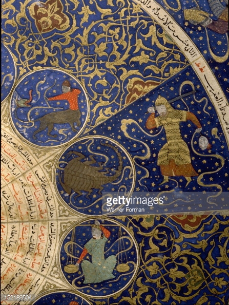
Close up of the scorpio portion of the Horoscope of Prince Iskandar, grandson of Tamerlane, the Turkman Mongol conqueror. This horoscope shows the position of the heavens at the moment of Iskandar's birth on 25th April 1384.
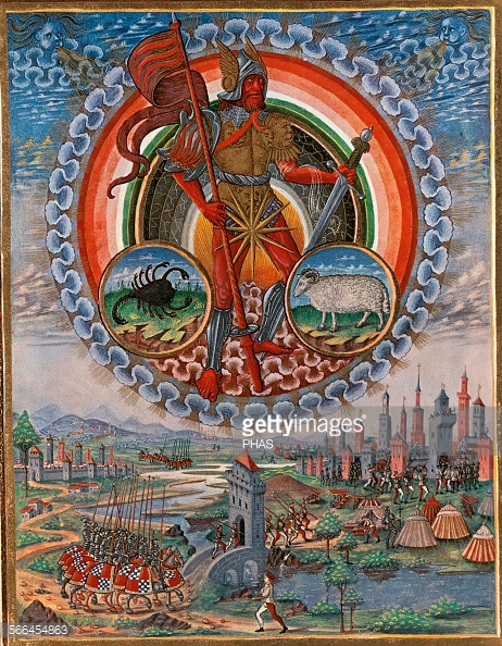
De Sphaera (The Sphere). Astrological book of Lombard origin. Illustrated by Cristoforo de Predis (1440-1486), 1470. Representation of Mars with the zodiac signs of Aries and Scorpio. This was my second favorite picture, and the picture of Mars in all his red glory might just find a place in a future scroll.
Les très riches heures du Duc de Berry, 1412 - 1416, French gothic. Scorpio looks more like a scorpion, but I didn't want to do a whole horoscope, just focus on the one sign.
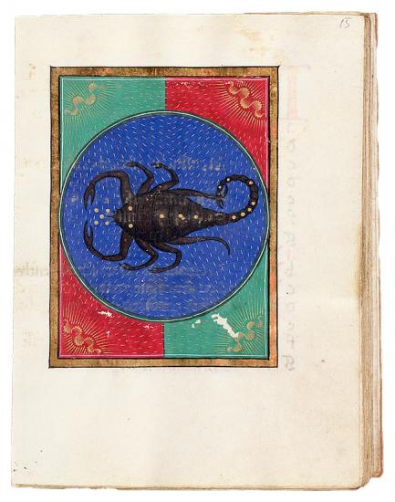
Scorpio, Book of hours, Italy, probably Milan, ca. 1473, This has a nice color scheme, but this is the epitome of black bug. What is interesting is that another artist for the calendar project chose this exemplar but for Libra.
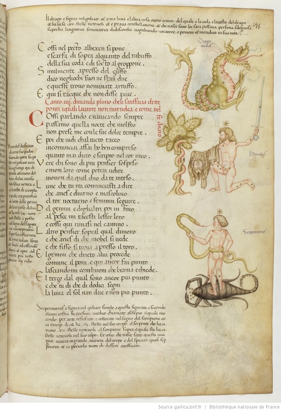
Manuscript from 1447, Italian, Fazio degli Uberti, Dittamondo II. This is an interesting one, but the color scheme seemed too faded for a calendar assignment. Here we start seeing the Dragons being included in the text.
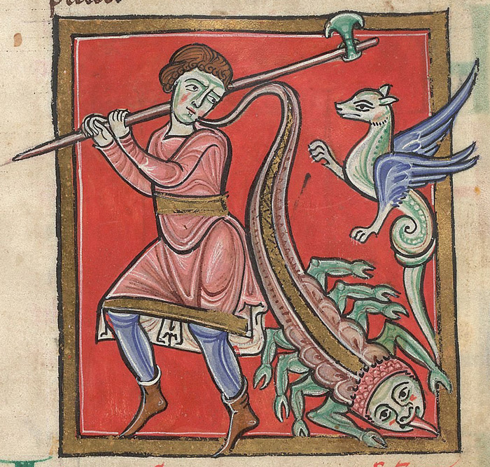
Illustrating the entry in a herbal for the plant called plantain, a man defends himself from a scorpion and a dragon-like viper (adder). Plantain was said to cure the bite of both creatures. This composition was interesting and had some potential. As with the previous manuscript, we see a scorpion and a dragon.
Above: Astronomical treatises [Sufi latinus], Scorpio, 1250-1275, Italy, possibly Bologna.
I found several examples where a dragon was used in place of a scorpion. There are additional ones here : www.bl.uk/manuscripts/Viewer.aspx?ref=lansdowne_ms_383_f002r
and here www.bl.uk/manuscripts/Viewer.aspx?ref=add_ms_50000_fs001r
I found several examples where a dragon was used in place of a scorpion. There are additional ones here : www.bl.uk/manuscripts/Viewer.aspx?ref=lansdowne_ms_383_f002r
and here www.bl.uk/manuscripts/Viewer.aspx?ref=add_ms_50000_fs001r
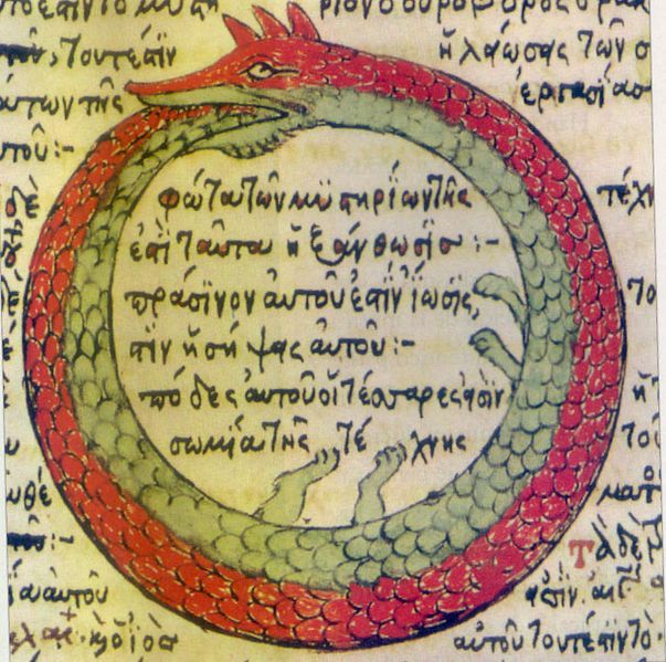
Drawing by Theodoros Pelecanos, in a 1478 copy of a lost alchemical tract by Synesius
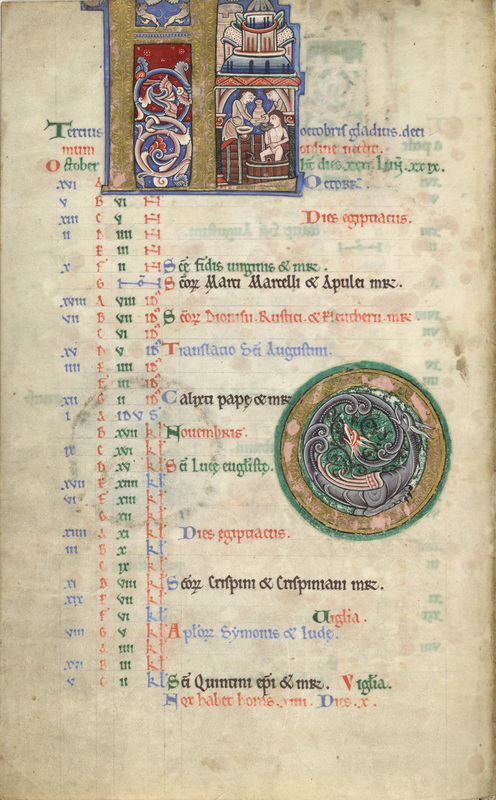
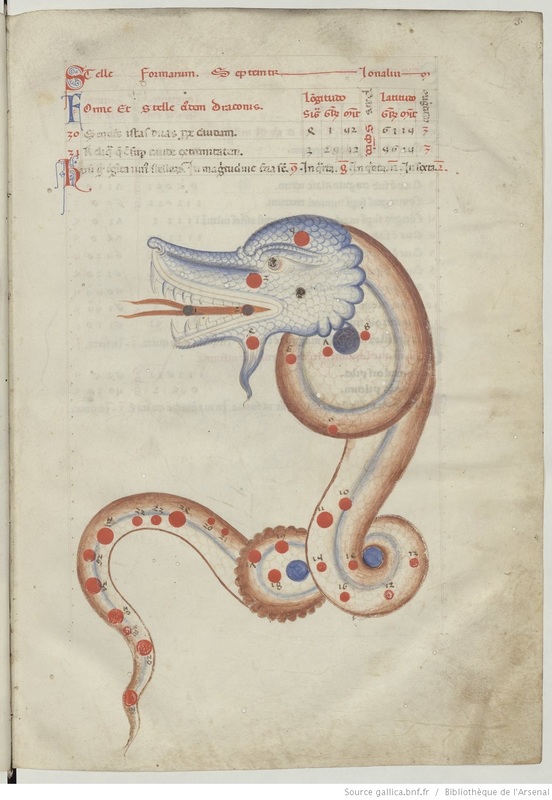
The Hunterian Psalter, England, C. 1170, Zodiac, Sign of Scorpio, Folio 5v. Two headed dragon.
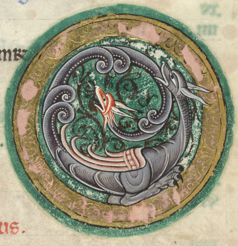
Close up of The Hunterian Psalter, England, C. 1170, Zodiac, Sign of Scorpio, Folio 5v
For extra points, I am subscribed to a blog called Medieval and Earlier Manuscripts and is published by the British Library. They post about calendars on a regular basis and recently on August 22 did a "Which Star Sign Are You?" on their blog. I was able to use this website to do more research on calendars and styles.
For extra points, I am subscribed to a blog called Medieval and Earlier Manuscripts and is published by the British Library. They post about calendars on a regular basis and recently on August 22 did a "Which Star Sign Are You?" on their blog. I was able to use this website to do more research on calendars and styles.
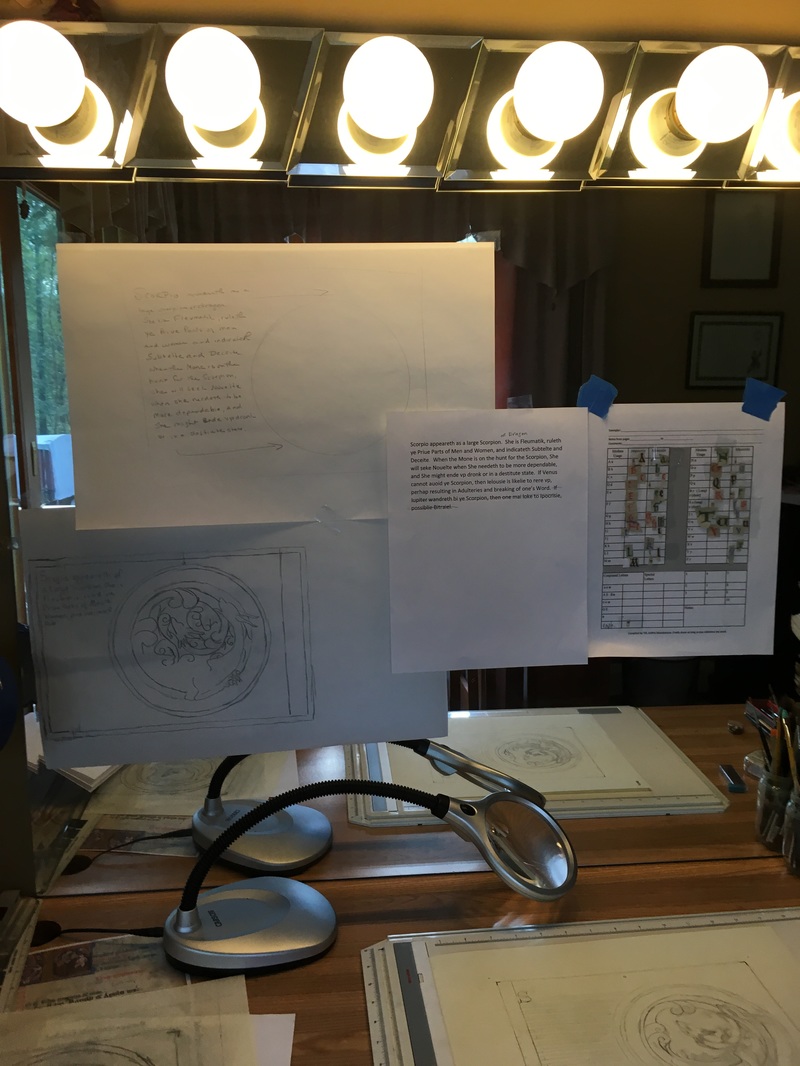
I decided that I loved the two headed dragon in The Hunterian Psalter. I set up my pictures, reviewed the text and decided I needed to amend the text to include that scorpio appears as a large scorpion or dragon. I would need to edit the text down to fit into the space I was allocating for the words.
The text ended up :
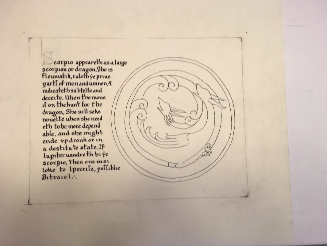
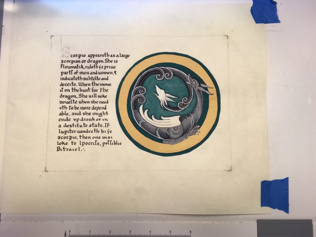
"Scorpio appeareth as a large Scorpion or dragon. She is Fleumatik, ruleth ye Priue Parts of Men and Women, and indicateth Subtelte and Deceite. When the Mone is on the hunt for the Scorpion, She will seke Nouelte when She needeth to be more dependable, and She might ende vp dronk or in a destitute state. If Iupiter wandreth bi ye Scorpion, then one mai loke to Ipocrisie, possiblie Bitraiel." Text by Master Christian von Jauergk.
The other adjustment is that I could not use gold leaf for the project (because gold leaf does not photograph well and so we are asked not to use it)and would have to substitute.
The text ended up :
"Scorpio appeareth as a large Scorpion or dragon. She is Fleumatik, ruleth ye Priue Parts of Men and Women, and indicateth Subtelte and Deceite. When the Mone is on the hunt for the Scorpion, She will seke Nouelte when She needeth to be more dependable, and She might ende vp dronk or in a destitute state. If Iupiter wandreth bi ye Scorpion, then one mai loke to Ipocrisie, possiblie Bitraiel." Text by Master Christian von Jauergk.
The other adjustment is that I could not use gold leaf for the project (because gold leaf does not photograph well and so we are asked not to use it)and would have to substitute.
LAYOUT
I printed the words and used a sheet that THL Geffrei Maudeleyne provides. This is the first time that I used this sheet, and it can be used as long as credit is given.
I printed the words and used a sheet that THL Geffrei Maudeleyne provides. This is the first time that I used this sheet, and it can be used as long as credit is given.
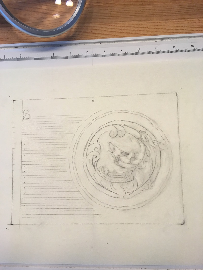
Layout, line drawing on pergemenata.
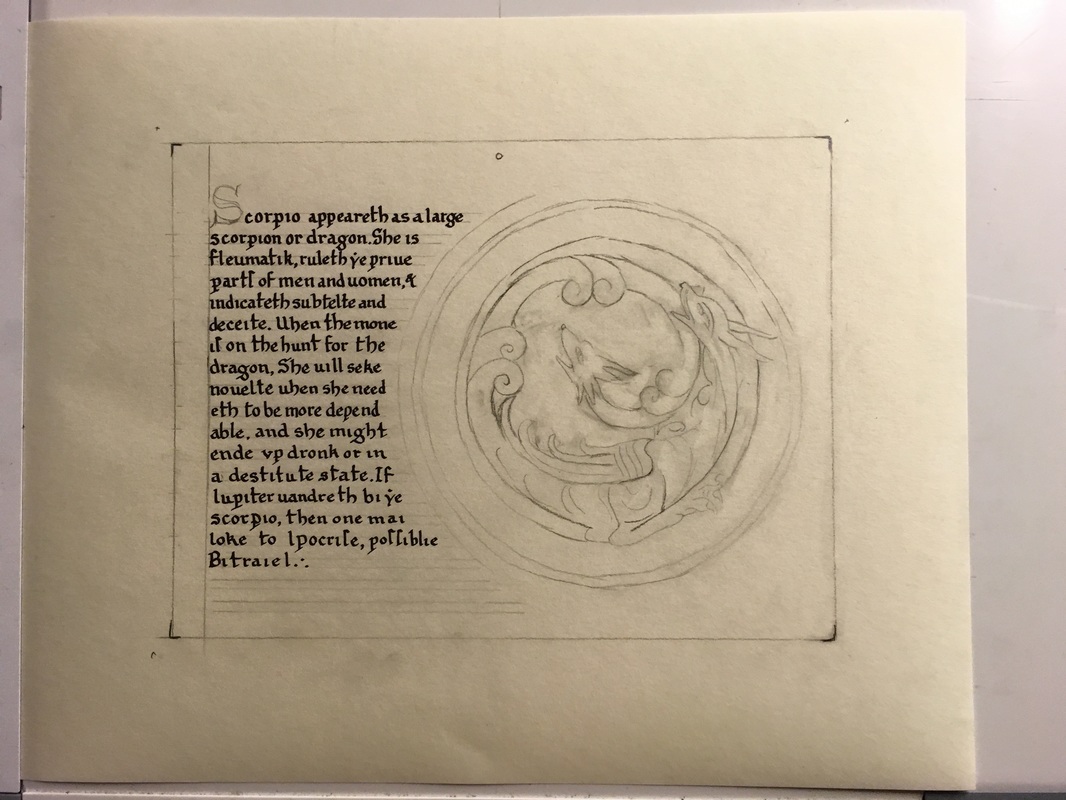
After many practice runs, calligraphy laid down. On one of the test sheets I made the entire layout complete with illumination so that I could lay down tests of the colors, inking, etc.
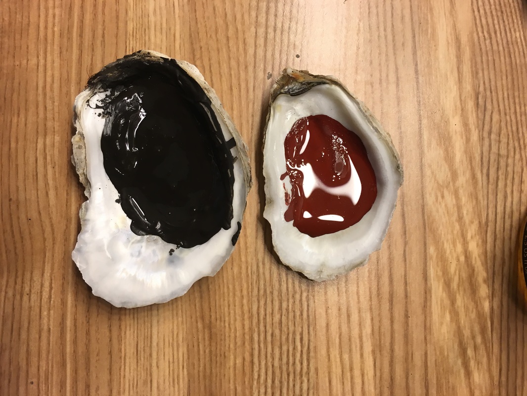
Mixing Rublev Roman black, and some Hematite. I ended up using the black, but not the Hematite. I mixed the pigments by taking the ground pigments, grinding them a little finer and then adding a little bit of water to moisten the pigment, followed by a couple of drops of gum arabic as the binder. I then mixed in more water to the desired consistency and placed the pigment in the shells that I had been collecting for some time.
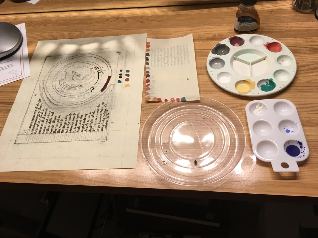
Color matching. See the test sheet with color matching in the middle, and then the test sheet on the left is available for laying the color down and checking how well it is mixed, if adjustments need to be made. This is the messy part of art that many don't see.
Cleaned up artwork, inking in the illumination. I used a crow quill pen and Higgins Eternal Ink.
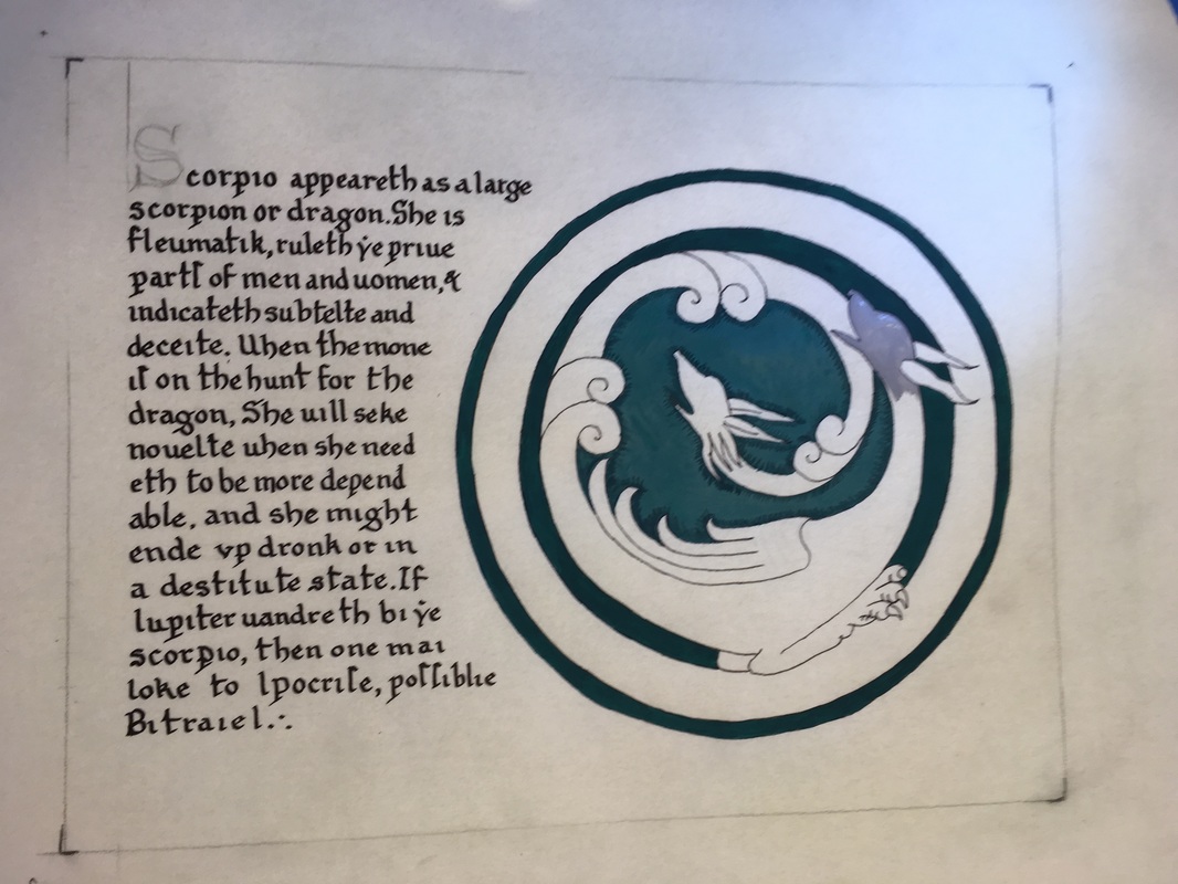
Laying down base layer of dark green and starting the greys.
I ground up some yellow ochre (same process as above, extra grinding, adding water, then gum arabic) and laid down a lovely shade of yellow. Not quite gold leaf, but it made for a nice contrast against the green and gold.
Now for the lovely details. This is where the roman black came in. The roman black is post period to the time period that I am studying, however, it is also closer to period pigments than just a nice processed black out of a tube of Windsor Newton. I felt that the substitution was acceptable, and am working on acquiring lamp black or bone black for experiments later.
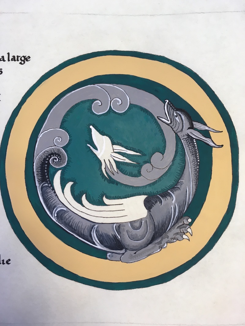
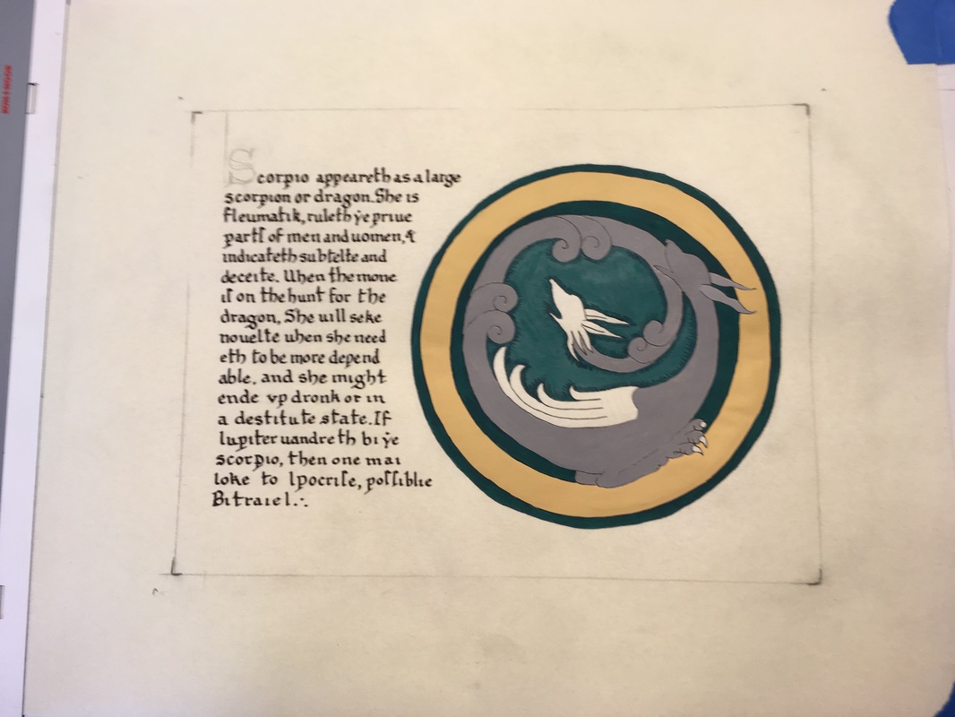
Close up of detail of two headed dragon. Note that there is some blending, but use of the period technique of small hatches (not cross-hatching, that is not found in the exemplars that I have reviewed) to apply the shading.
First layer of detailing on illumination.
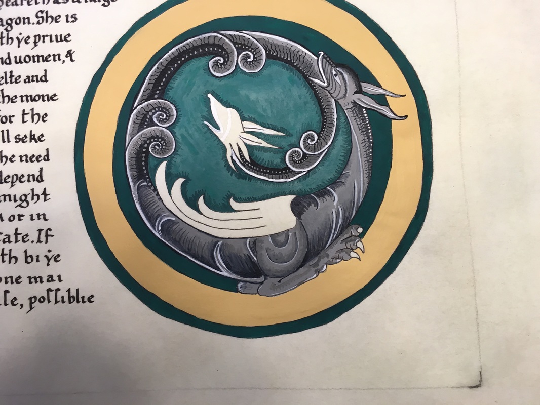
Closeup of hatching technique, and layering.
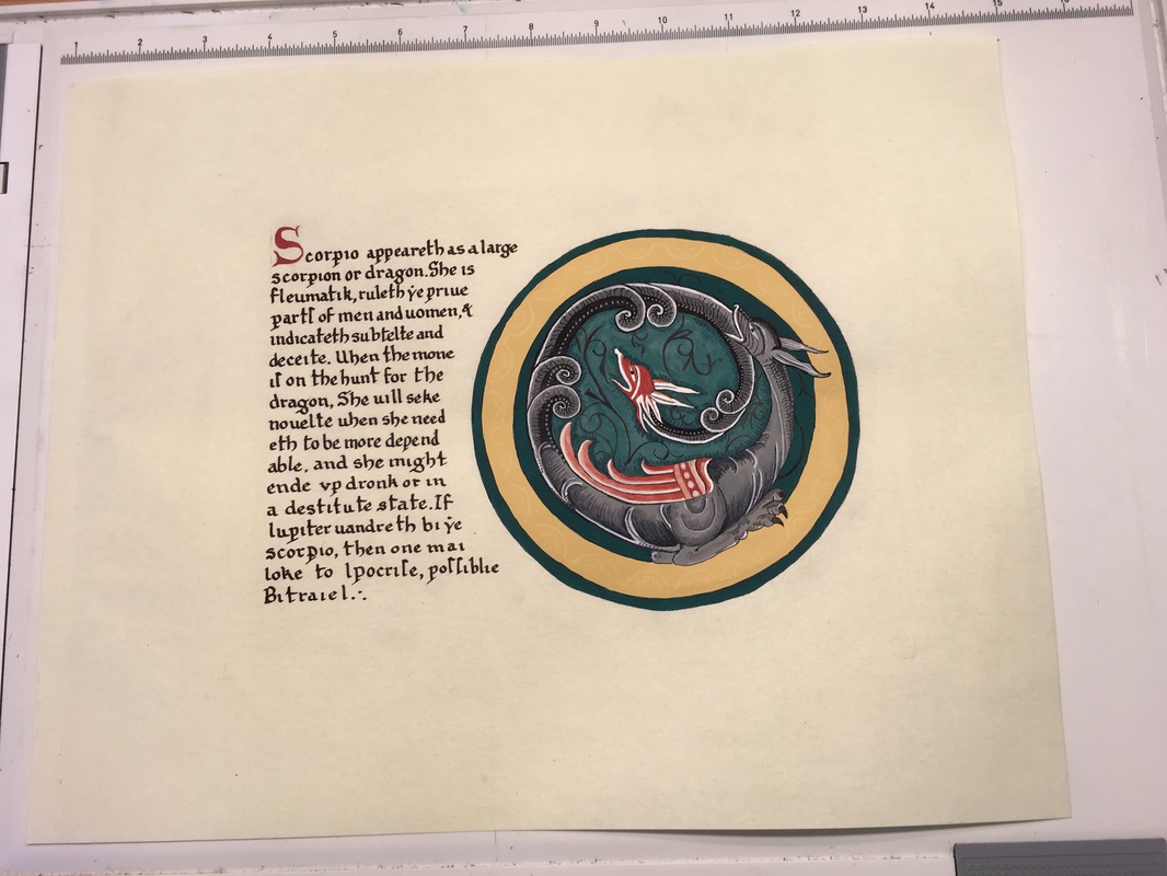
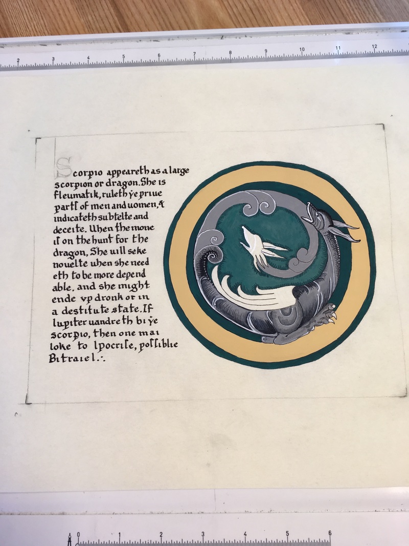
Addition of the red pigments on the initial "S" and on the dragon. Three different shades of red employed for the details of the wing. Dark greenish black filigree in the green interior around the dragon. Paint the dragon's toenails black. More subtle shading of the entire dragon, building up color, shades, nuances of bone and muscle.
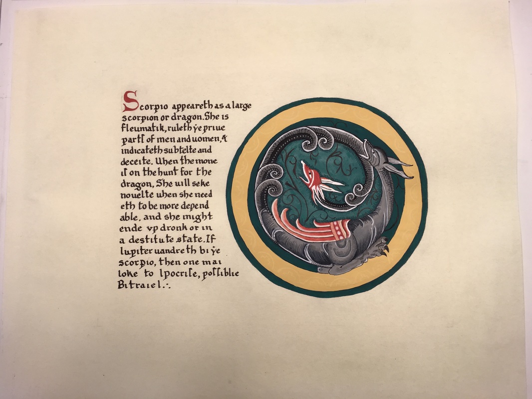
Finished piece. Light circle details in the gold circle, highlights and deepening of the dark areas. Application of eraser in all areas.
Reflection :
I have noticed that I need to take a step back while working, as there are flaws that I see from afar that I do not see when nose is two inches from the work. My calligraphy is improving, however, I still need to work on my spacing. Even six months later from when I was working on this in July, I can see improvement in my calligraphy in my current pieces that I do not see here. I also need to work on my technique of not so bumpy circles, which is the first thing that jumps out at me when I look at this illumination now. I will be researching some techniques, and also practicing inking in and painting in cleaner edges. I love the dragon. I think that the body of the dragon is some of my best shading work.
All in all, I am proud of the research, which I think is much more in depth than previous work, and that the level of painting is getting better and better, but I see still see places where I can improve.
 RSS Feed
